appropriate iconography
 Due to some peculiarities in how GC handles it’s saves I had to explain to someone the other day that they needed to click on the icon with the floppy disk on it.
In a crushing moment of feeling old, I realised that it was only fluke that they knew what a floppy disk looked like. It’d be like someone telling me that I needed to look for the 8Track, I know what it is, but i have no idea what it looks like!It just set me wondering if this whole thing has taken on a life of it’s own like letter forms going from pictograms into Assyrian (there’s great diagram on p112 of David Crystal’s excellent book - How Language Works) .
Are we going to have a generation, lets say today’s 10 year olds, coming through in a few years that know exactly what a save icon looks like, but no idea what it depicts, it’s just the symbol for save?
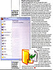
 I had a quick look around, and I found an alternative icon for save, but as floppies disappear from our collective conscience, perhaps too will manilla folders.
Is it necessary for the images depicted in icons to remain contemporary, or is it sufficient that the icon’s intention remains intact, and the meaning can become obsolete?
 Update
John sent me this scanned article from about the same time as I wrote this. It says more or less the same as I did. John, if you can remember where it came from then let me know.