BP Quiz gets going
The bpQuiz site is up and rolling along nicely.
I thought I’d start building the results graphs so that you can see how they are starting to form.
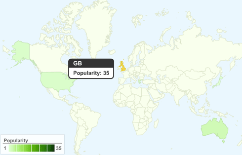
For starters, here’s a map of who has taken the quiz so far (as of today Thursday). As usual wordpress won’t allow me to do anything fun, so if you click on the picture below it’ll take you to the bpquiz proto-blog.
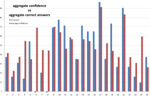
This one shows the aggregate confidences assigned to the questions (the red bars) next to the marked responses (the blue bars)
It is interesting to see how they differ on a few questions, but also how well correlated they are too in general. I was expecting to see a more pronounced difference.
There are plenty more graphs coming up when my sanity and enthusiasm for graphs allows!
Finally, if you’ve done the quiz, and you feel bad for not getting too many right, don’t! The average score is currently about 44%, so you probably did better than you think.
If you haven’t done the quiz yet, then get over to http://bpquiz.co.uk/ and have a go!

