Moar power?
If I really smash it I can hit 0.18 horsepower!
I’ve been meaning to try using d3 a bit more proper like after I skimmed it for my nearest a few weeks ago. I’ve got the Interactive Data Visualization for the Web book by Scott Murray, and I read it as prose, then jumped straight into the middle of it and tried the code examples and I really should have worked through it methodically. (Maybe feeling stupid will give me some motivation now!)
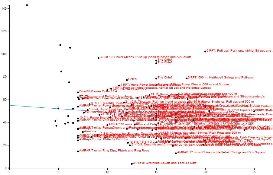
This graph displays my workouts since I started tracking them using Beyond the whiteboard 6 months ago
- The x axis is length of workout, i.e. how long it took me to complete it.
- The y Axis is the wattage as calculated by BTW
- The blue line shows the line of best fit between the filtered workouts
To use it, just set the slider to the time window that you are interested in.
There is still a lot to do in terms of interactivity.
- Names shown on roll over - not all the time
- a slider to control the date window
- maybe a way of showing a number of best fit lines for different time windows to see if there is improvement.
- I'd like to also try changing it to a curve of best fit eventually.
The data is scraped from their website, so isn’t live (snapshot taken on 2013-06-05).
The why story
Recently I’ve been having a bit of a cry at the gym, I feel a bit like I’m slipping backwards in terms of work capacity.
Being a big QS nerd I’ve been tracking my performance since I started1 with beyond the whiteboard so I have the historical data on how I’ve been performing.
Looking at the results I can see that what’s really happening is that I’m progressing, but not as fast as the people around me. A bit like being on a train that’s being overtaken by another one; you feel like you are going backwards, but really you are going forwards! It’s a pretty simple three step process for improving more though:
- fix my diet
- harden up and rest less between bits of doing
- profit
-
apart for a bit of a lapse a couple of weeks ago :( ↩
