My nearest...
I’ve been pretty interested in what you can do with maps recently. There are loads of really nice map tools coming out for Open Street Maps (leaflet, mapbox, tilemill, and more), and there will probably be a load more for Google maps since their announcements at IO.
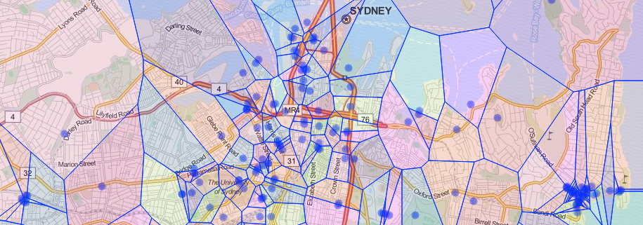
As a start at trying to work out the level of amenity for a given spot, I thought I’d take a crack at recreating the work that John Snow, did on the 1854 Broad Street cholera outbreak. (Sort of.)
It’s a bit more of my adventures in web development - so it’s an adaptation of Calvin Metcalf’s psychic-octo-nemesis template. It uses D3 to do the Voronoi and Leaflet to display the map. It gets its data from Open street maps’ Overpass system.
The closest…
There are lots of problems to take into account when thinking about this as a measure of amenity, not least that we don’t travel like birds, but need to use paths and roads, so the cells aren’t especially realistic. However, I like to think about models as a tool to help understanding - if the model disagrees with your internal model then one of you needs to adjust.