Major study: Design under conditions of uncertainty: Calibration, design & hitting a moving target in the dark
At Oxford Brookes they have figured out that doing another year of design studios won’t make much of a difference, so in your diploma you do a year of actually learning something. There are a few options to take that are basically the taught component of a masters degree (write a thesis on top and you get an MA!). The option I took (on 2009-10) was to do a Major Study. This was a chance to spend a whole academic year looking into a research topic of my own choosing. I had an excellent cohort with me, some of the other projects were about design for agrophobia and how public outpourings of grief worked (e.g. Diana).
My topic started off as future prediction methods, but morphed into overconfidence. I think it was because being properly calibrated was necessary to get one’s future predictions right. (I say “think” because it was over 5 years ago now.)
As I said with my undergrad dissertation, there are going to be translation errors below from the original format, so if you see something important then let me know. If you want to see it in that format, the PDF is here (11mb). I’ve broken a few bits of it out because they are really image heavy, and other bits because they are better in a second tab for reference (e.g. all the appendices).
I’m a lot less arrogant in this than I was in 2005, but still more than I am now! That said, I’m still pretty pleased with how this turned out.
Design under conditions of uncertainty:
Calibration, design & hitting a moving target in the dark
Ben Doherty P30600 26-04-2010 [email protected]
This paper proposes that good calibration is important for good design. It shows a study which measures the calibration of architects with reference to a realm that is characterised by turbulence-inducing, rapidly evolving information– in this case building performance and legislation relating to the low carbon economy. Architects show substantial over-confidence on questions that they feel confident about answering and accordingly this paper offers some proposals that may help to alleviate the negatives effects of this.
A Major Study presented to the Department of Architecture, Oxford Brookes University in part fulfilment of the regulations for the Diploma in Architecture.
Statement of Originality
This Major Study is an original piece of work which is made available for copying with permission of the Head of the Department of Architecture.
Signed
Table of Contents
- Design under conditions of uncertainty: Calibration, design & hitting a moving target in the dark
- Introduction
- Research Methodology
- Example of interaction
- Limitations of research
- Case study – Carbon Buzz
- Result analysis
- Discussion
- Proposals
- Conclusion
- Appendices
Acknowledgements
A lot of people have shaped this work as it has progressed. I’d like to thank Harriet Harris, Matt Gaskin and Igea Troiani for tutoring me; I know that it must have been difficult as I have previously been described as unteachable. Jerry Ravetz and Peter Biddlestone provided invaluable, fascinating discussions early on; without them realising, they changed the direction of the work beyond recognition. Charles Ogilvie, Sophie Chisholm and Erika Ammerman have provided endless technical advice, moral support and proof reading. Judit Kimpian has provided not only her time, wisdom and moral support, but also an insight to the workings of Carbon Buzz.
Although a great many of my mistakes have been picked up by the diligent eyes of my friends, any that remain are entirely my own doing.
Introduction
Rationale and hypothesis
Design emerged as a response to the rate of change exceeding the pace at which solutions could be found naturally, in an ‘unselfconscious way’ (Alexander, 1964). This increased rate of change means that design has become a conscious activity where solutions need to be actively sought.
 Technology, science, policy and culture have always had a feedback relationship, mediated mostly by design[1]. The extent to which change has driven design has varied over time; sometimes new designs have prompted social changes, i.e. the iPod and iTunes causing a re-evaluation of the music business and the way the public consume media, or the culture of conspicuous consumption in the 1950s where the availability of products defined people’s identities . Although this topic would merit an entire thesis of its own, it would probably not be too controversial to claim that we are currently experiencing rapid social change which is driving technology to keep up.
Within any design process the drivers need to be well understood in order to produce a well-fitting design. The designer’s knowledge of the context within which the solution will be realised is often far from perfect. In hindsight there are usually factors that could have been considered or knowledge that should have been gained to feed the decision making process (Kuhn, 1962). There are also situations where the designer was either too lazy, too pressed for time, or too arrogant to gather and assimilate all the required information. Without going into the debate about the existence of an objective truth[2], this means that although the design might well be perfect from the point of view of the designer, i.e. fits all the criteria as understood from the brief, it might be far from well-fitting to the actual environment of use.
“The curious task of economics is to demonstrate to men how little they really know about what they imagine they can design.”
F A Hayek, The Fatal Conceit
Decision making is at the heart of the design process and therefore I propose that being well calibrated (Lichtenstein, Fischhoff, & Phillips, 1981) is an important skill. Calibration is more fully defined further on, but very simply it is an awareness of how well one knows what one knows. I.e.not how well a mastermind competitor knows their chosen subjects but how objective they are about how much they know i.e. whether it should be their chosen subject on mastermind at all!
Where is the Life we have lost in living?
Where is the wisdom we have lost in knowledge?
Where is the knowledge we have lost in information?
T.S. Eliot, “Choruses from ‘The Rock’”
Information is not knowledge,
Knowledge is not wisdom,
Wisdom is not truth,
Truth is not beauty,
Beauty is not love,
Love is not music,
and Music is THE BEST.
Frank Zappa, “Packard Goose”
I believe that design is somewhat analogous to forecasting in that they are both conscious projections of the present into the future. Forecasting relies on good quality priors to achieve an accurate result, and poor priors lead to inaccurate predictions. Forecasting differs only in that there is no implication that anything will be done about the prediction, whereas design generally leads to an attempt at a solution.
I intend to study the gap between designers’ ‘knowledge’ (Bellinger, Castro, & Mills, 2004)[3] and the currently accepted ‘facts’, more specifically their confidence in this knowledge[4]. Firstly to ascertain if there is indeed such a gap; secondly to examine the extent of this miscalibration, and how this might the affect design process.
Awareness of the potential for imperfection in our knowledge, ’I know proposition P with a certainty of 60%‘, allows decisions to be made with “known unknowns” (Rumsfeld, 2002). As the rate of change increases (Kurzweil, 2001), the ability to design under conditions of uncertainty will become more pressing. The temptation to design “loose fit” (Hillier, Leaman, & Stansall, 1976; Price, 1990) solutions that end up being a lowest common denominator becomes initially appealing. By having a good grasp of what is currently unknown–and by how much–there may be an opportunity to design a solution which is currently well fitting. Moreover it is also possible to make designs more robust to the future whilst still being relatively specific to the uses they will have over their lifetimes.
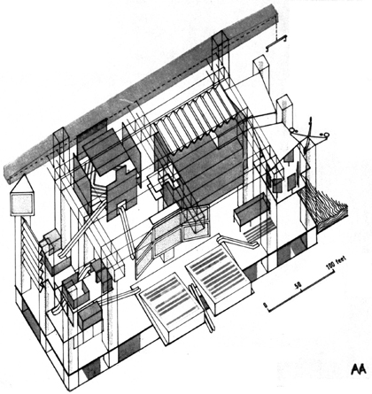
Cedric Price’s Fun Palace, a completely reconfigurable shed space to allow robustness to future changes, but without being specific to anything.
This logical and slightly scientific (but hopefully not sciencist[5]) approach to design is likely to elicit a reaction that it should not be undertaken because creativity and serendipity play an important part in the process of design. The critic might argue that by asking the designer to explain each feature in infinite detail it will remove the magic and stifle their creativity. I think that although some designers might achieve great things through moments of inspiration, there is also a strong tendency by the majority to regress towards the mean and produce work that is only a little different to the existing body of work. In science leaps of creativity often occur when a problem is completely constrained[6] Design has been described as an activity of manipulating constraints to find a solution (Kilian, 2006) and the fulfilment of these constraints can sometimes be quite arduous. This seems to imply that designers must become infallible number crunchers, but Decision support systems may offer some assistance here, these are discussed later.
To be able to talk about the calibration of experts in a particular are of knowledge, it is necessary to choose one to focus on. For this study environmental issues fill this role.
Environmental issues have, for varying reasons, always been high on the list of constraints that architects have wrestled with ever since buildings have been consciously designed (it was a key concern before that too, but it was “unselfconsciously” (Alexander, 1964) consumed into the emergence of the built form). Recently the environmental lens has shifted off protecting ourselves from the world, to protecting the world from us. The concerns in the 1990s about pollution, the ozone layer and acid rain were largely able to be addressed by manufacturing and industry, and apart from some remedial work on old stone buildings, the effects weren’t felt significantly in the architecture profession.
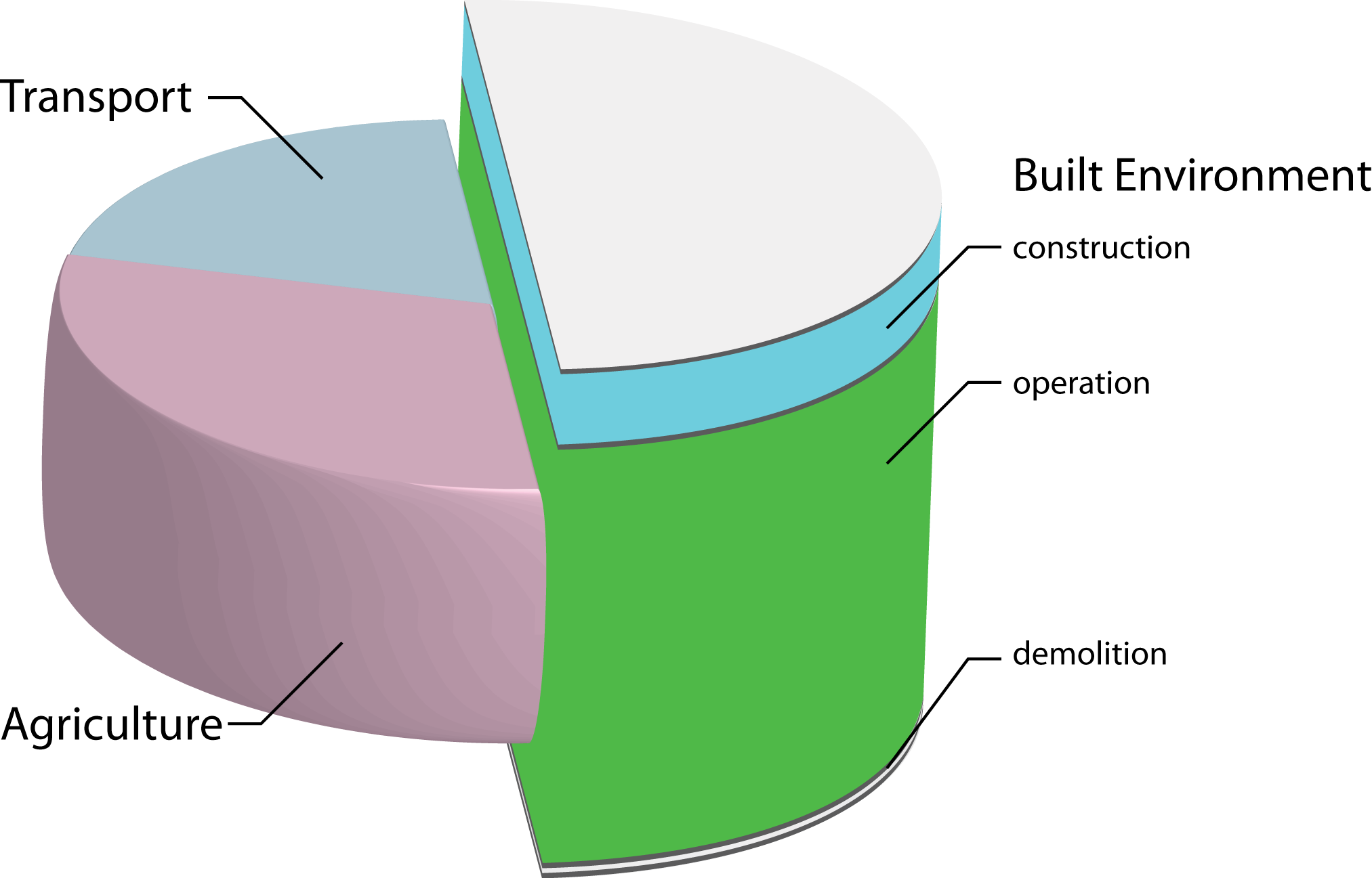
The subdivision of emissions from the UK, showing a further subdivision of the contribution that the built environment makes.
Over at least the past five years an overwhelming consensus has emerged that anthropogenic climate change is real, and not a statistical anomaly[7]. The most substantial concern currently is that of global warming caused by greenhouse gas emissions. Buildings emit a substantial proportion of the developed world’s greenhouse gasses (reports like the UN’s Common Carbon Metric put them at above 30%[8] in terms of CO2 equivalent emissions (UNEP SBCI, 2009)). A substantial proportion of that is operational energy (making the building habitable, i.e. heating, powering lifts, and lighting), rather than energy to run the building (the processes that occur within the building, i.e. weaving cloth, running computers, or smelting aluminium). Therefore architects can make a substantial contribution to greenhouse gas emission reductions. This is without even beginning to consider second order effects like how urban density can affect transport related emissions.
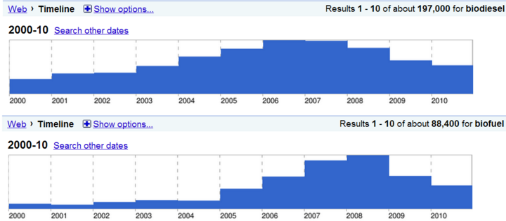
Google timeline searches for biodiesel (above) and biofuel (below) showing the change in their media profile over time. As the biodiesel hype became less substantial, the more general term of biofuel became more popular. There were 197,000 results for biodiesel between 2000 and 2010, and 88,400 for biofuel for the same period. Go to http://tinyurl.com/BDline and http://tinyurl.com/BFline to see these results live.
Climate change, environmental design and the low carbon economy have a rapidly evolving scope that is very difficult to maintain a good grasp of. For this reason these have been chosen as the factors that affect design to be considered in this study. A recent example of this was the excitement surrounding the emergence of bio-fuels around 2005.
Bio fuels supposedly had a zero carbon footprint due to the carbon that they emitted while being burned being absorbed during their growth. They were also hailed as a relatively democratic method of energy production because all that was needed was land and water. This meant that they shot to stardom as the darling of the environmental blogosphere remarkably quickly. The initial excitement gave way to the reality of the ‘food vs. fuel’ debate, as it was realised that in order to replace fossil fuels with bio fuels it would put so much pressure on food agriculture that it would be prohibitively expensive to eat! Corn gave way to jatropha which could be dual cropped with food, which in turn was replaced with algae derived fuel, but in general it has been realised that a wholesale switch to bio fuel won’t be the sole saviour of the human race, but it does have a place in a broader portfolio of energy technologies. The rapidity with which bio fuels burst into the awareness of designers, coupled with the lack of easily available information (i.e. expected yields per m2 or energy density) led to a spate of totally unrealistic claims about integrated bio fuel production with buildings which came woefully short of ever hoping to supply the expected amount of energy.
This kind of over-confidence, or over exuberance, is to be expected with any new technology as the claims to counter those made by evangelists of the new technology have not yet been put forward, but it could have been dampened slightly by designers taking a more analytical view of things. This isn’t necessarily that easy, and requires not only analytical skills, but also benchmarks to compare to in order to construct a plausible reality. I am not advocating a pro-cynicism view, but a pro-analysis view, where we can still be optimistic, but with an understanding of how things fit into a broader context[9].
The Carbon Buzz project provides just such a set of tools. It provides a service for designers with which to analyse their proposal, and also a verified picture of reality for comparison. It is already starting to show that our design predictions are sometimes more than an order of magnitude over-confident. In contemporary design theory seven steps have been identified: “define, research, ideate, prototype, select, implement, and learn” (Ambrose & Harris, 2009). Architecture really only engages with the first six of these, leaving ‘learning’ to be an implicit step. Carbon Buzz is an example of a project that encourages designers to learn from their projects. Carbon Buzz is examined in more detail as a case study on page 73.
It is important to emphasise that this study is not fundamentally about environmental issues, but about quality of knowledge. Environmental issues have simply been chosen as a convenient vehicle to ascertain quality of knowledge about an unstable topic, and the results should be equally valid in any realm that is characterised by turbulent and rapidly evolving information.
This paper is in two parts. The first explains the method used to test designers to ascertain their quality of knowledge about a specific realm, and analyses the results gathered from this. The second contains some suggestions on how cognitive biases that cause poor decisions might be avoided. Most of the available literature refers to economists, politicians, military generals and physicians, therefore the second part will contain some suggestions as to how these skills could be applicable to architects.
Applications of this work could be found by designers wishing to reflect on their practice and allow this reflection to feed back into their design process. It also has uses for building simulation. As most buildings are prototypes, making verified models that we have an idea of how much confidence we ought to put into them will allow for our relationship with these prototypes to be more fruitful.
Hypothesis
Designers are over-confident about the extent of their knowledge about renewable energy technology, building performance issues and associated legislation.
Overcoming arrogance - what is the point of all this?
General reasons
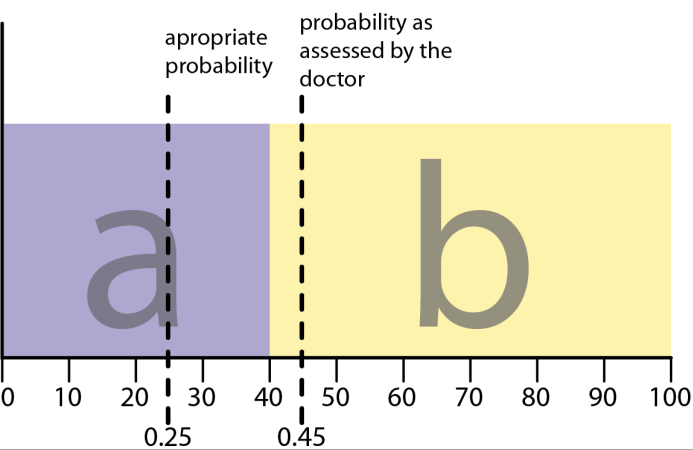 The most obvious example of why being well calibrated is desirable is in medicine. If you go to the doctor and present a certain set of symptoms, the doctor must decide if you have condition a or condition b. If you have condition a, then you should receive the treatment for that, and if you have condition b, then the converse is true. In general, with your symptoms, you are better off having treatment a if you are at least 40% sure that you have a, otherwise the treatment for b is better. If your actual probability of having a is 0.25, but your doctor assesses it as 0.45, then you will receive a less than ideal course of treatment.
The above example shows how poor calibration can cause undesired effects in the critical region. If the pay-off function is steep, as it is above, small errors in calibration can have really catastrophic effects.
The other situation where being well calibrated is particularly desirable is where one is making a long chain of decisions, and each one depends on the outputs of the previous one. These sorts of errors can have very shallow pay-off functions, but the errors can multiply each other, leading to just as catastrophic consequences. This is just the kind of situation one finds oneself in in the design process, where a small decision at the beginning can have a huge impact on the ultimate result. For example, if one stacks bricks up with ±1° tolerance, and they are all biased 1° to the same side, then by the 180th brick there will be an arch when the instructions were for a column.
Specific reasons for architects
The prevailing paradigm is for architects to be the main point of contact with a client, and then any consultants being chosen and appointed by the architect where this is deemed necessary. The architect is then potentially in a position of considerable risk. They could choose inappropriate consultants, or chose not to appoint a consultant for some part of the process that they are either ignorant of their ignorance, or overconfident about their ability to do proficiently. They are also at risk of not making any profit if every part of the process is subcontracted to consultants, so there is a skill involved in being well calibrated in order to appoint consultants where necessary, and to take onboard the risk of doing the job themselves when it is felt that sufficient competence is available internally.
Whether better calibration can result in better design is subject for another study. Apart from the challenge of finding an appropriate metric for this, it would require a much more in depth investigation.
One area of design that could potentially benefit from better calibration is the relationship between architects and value engineers. This is often adversarial, but if appropriate realism[10] was applied at the initial design stage then it might reduce the amount of ‘meat’ that gets cut out of projects in later stages. This does raise questions of curtailing aspiration, but it might well be another valuable investigation to make.
Hitting a moving target
The rules of the game
One way, that’s kind of a fun analogy in trying to get some idea of what we’re doing in trying to understand nature, is to imagine that the gods are playing some great game like chess, let’s say, and you don’t know the rules of the game, but you’re allowed to look at the board, at least from time to time, in a little corner,perhaps, and from these observations you try to figure out what the rules of the game are, what the rules of the pieces moving are. You might discover after a bit, for example, that when there’s only one bishop around on the board that the bishop maintains its color. Later on you might discover the law for the bishop as it moves on the diagonal which would explain the law that you understood before-that it maintained its color- and that would be analogous to discovering one law and then later finding a deeper understanding of it. Then things can happen, everything’s going good, you’ve got all the laws, it looks very good, and then all of a sudden some strange phenomenon occurs in some corner, so you begin to investigate that-it’s castling, something you didn’t expect. We’re always, by the way, in fundamental physics, always trying to investigate those things in which we don’t understand the conclusions. After we’ve checked them enough, we’re okay.
The Pleasure of Finding Things Out, (Feynman, 1981)
With the constantly evolving nature of knowledge, there is inevitably a lag between new knowledge being generated at the cutting edge, and that filtering down to those in a position to implement it. As Richard Fenyman so elegantly describes in the box opposite, nature’s framework is well established, and as we explore it we discover new information, and make new rules. This new information might contradict existing rules, so they need to be reconciled with the old rules. Thomas Kuhn explains this in The Structure of Scientific Revolutions, with the example of ‘scientific’ ideas such as Aristotelian dynamics, which are now discredited, but are nonetheless still considered to have been science. Our current ideas are simply our current understanding of nature. These are waiting to be superseded by a newer or more refined explanation of how nature behaves.
This means that we can never be completely confident in anything that we know, as it may well have been superseded by newer information that we are yet to turn into knowledge. A simple example of this is the value assigned to the 100 year radiative forcing potential (RFP) of methane (CH6). Radiative forcing potential is the effectiveness of a substance as a greenhouse gas compared to carbon dioxide (CO2) (CO2 has an RFP of 1). In the 2003 IPCC (IPCC, 2003) report it was reported as 23, and this became quite widely held ‘common knowledge’, but in the 2007 report (IPCC, 2007) it was reported as 25[11]. It is now over three years since the publication of the 2007 report, and it is not uncommon to hear 23 quoted as the RFP for methane.
This is illustrated in the final section of the discussion chapter with an example of the rapid evolution of knowledge that actually happened while producing this study.
What is calibration?
In the context of decision making, if a person makes a prediction, then when pressed they could also give a confidence in that prediction. If, over repeated judgements, that confidence correlates well with the frequency of those judgements being proven true, then that person is said to be well calibrated. Put another way, if I assign a 70% probability that I will be able to throw an apple core into the bin, and 70% of the time it goes in then I am well calibrated with regard to my apple core throwing abilities. If it goes in 100% of the time, then I am under-confident, if I miss most of the time and only get it in 40% of the time, then I am over-confident.
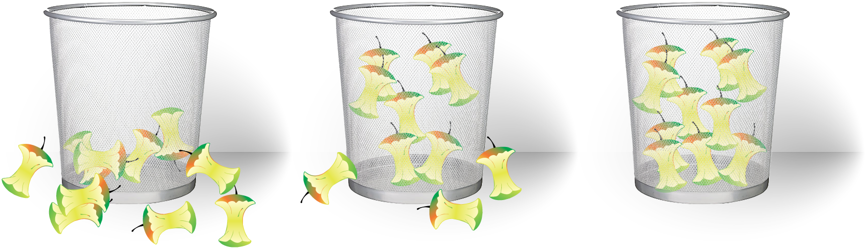
| 4/10 apples in the bin, over-confident | 7/10 apples in the bin, well calibrated | 10/10 apples in the bin, under-confident |
Many people will initially assign an intuitive prediction that bears little resemblance to the actual probability of correctness, i.e. “I have complete confidence that I am right” corresponds to a 100% confidence, or “I have no confidence (0%) in that answer”. When pushed a little further people tend to weigh up their confidence more carefully. This can often be done by offering some form or reward for providing an accurate assessment of the likelihood of correctness as in De Finetti’s game (Aczel, 1989; Paran, 2008). The effects of people’s intuitive swing to the extremes of confidence are discussed in the discussion chapter.
De Finetti’s game
“Your friend tells to you, coming out of exam hall, that he is getting a maximum score (a centum). How much is that certain now? To measure this, all one have to do is to ask few questions. Tell him that, in a bag, there are hundred balls. Out of which 98 are white and 2 are black. Given a chance, like, a thousand rupees bet, for either drawing a white ball from the bag or wait till exam results and on getting the score as 100. Assume that the answer of your friend as “draw the balls”. Now, increase the black ball count to 20 (80 White + 20 Black). And ask him to pick between drawing a ball from the bag or wait till the exam results. If he chooses to wait for the exam result for the thousand rupee bet, increase the white ball count to 90 (90 White + 10 Black) and repeat the same test. If he wants to draw, then increase the black count to 15 (85 White + 15 Black) and repeat the experiment. End this game with a sufficient interval. Say, between 85 and 88. This means, that the subjective probability of your friend getting a centum is anywhere between 85 ~ 88.”

Quoted from http://tinyurl.com/DeFinettigame (Paran, 2008)
A brief history of calibration studies
Calibration has been studied formally since at least the early 1950s & 1960s (Adams & Adams, 1961; Brier, 1950) under many different names. It saw its conception in meteorological forecasting. Ernest Cooke, the Government Astronomer for Western Australia wrote two papers in 1906 (Cooke, 1906 a&b) stating that all subsequent weather forecasts were to be assigned a confidence level; “almost certain to be verified” “normal probability” and “doubtful”. Because of this, a great deal of early work on calibration of probability assessment focuses on weather forecasting due to the very large dataset. In general weather forecasters are reported to be very well calibrated, and their calibration has been improving as their models are progressively refined, and their experience base grows.
There has been extensive work done by cognitive psychologists for academic purposes. This work has provided most of the methodology that has become standard in calibration testing. Most of the work has involved using students as test subjects, so there is often a question over the subjects’ motivation to provide well considered responses. There has been some work on expert calibration, some using students and testing them on their subject of study, and some on medical professionals – it turns out that doctors are not anywhere near as well calibrated as weather forecasters!
One paper (Adams & Adams, 1961) presents the “grossly over-confident calibration curve of a schizophrenic who believed he was Jesus Christ”. Hopefully architects over-confidence won’t reach these levels.
Ignorance ≠ stupidity
The point of a calibration assessment is not to find out how much a person knows, but rather to assess what a person knows about what they know.
If an ‘expert’ from one field, say 1990s TV soap operas were to answer a set of questions about their area of specialisation then they would probably get a high proportion of them right. If they were to answer a set of questions about hydroponic growing media for strawberries in greenhouses then unless they had a peculiar dual specialisation they would probably get a high proportion of the questions wrong.
Neither of the above examples takes into account the meta-knowledge of how much the soap expert thinks they know their subject (experts have been shown to be pretty variable in their calibration (Lichtenstein, Fischhoff, & Phillips, 1981)). If our TV soap expert is well calibrated and assigns low confidence to their answers about all things greenhouse related then they are showing an awareness of their ignorance about that particular subject.
Contrary to the popular use of the word ignorant, as it is shouted from car windows by angry motorists, ignorance is simply a lack of knowledge. If a person knows the areas where their knowledge is strong, and those where they ought to seek assistance then they are more likely to be well calibrated. A well calibrated ignorant person is likely to seek information to rectify their ignorance, whereas a poorly calibrated one is likely to remain ignorant.
What constitutes the truth?
The truth has been an evasive subject for philosophers since the Greeks, and probably even before that. The ‘objective truth’ was finally proven to be unknowable by Kurt Gödel’s incompleteness theorem. This level of the truth is not really much use to messy subjects like architecture, but the truth isn’t really a very useful concept in general. As Richard Feynman explained earlier we are constantly being revealed a bit more of the path to the truth. Thomas Kuhn formulated the ideas of ‘normal science’ and ‘mature science’ (Kuhn, 1962). These terms describe a state in which knowledge is fairly stable, and any changes are by degree, and not a fundamental rethinking of the field. Kuhn terms the whole stable period a paradigm. In these inter-paradigm periods, the truth can be referred to by practitioners of that field as some knowledge that is widely held by the practitioners of that field, and has not yet been convincingly refuted. This allows them to progress without having to rebuild the foundations of their discipline every time. Although this study deals extensively with the behaviour of knowledge around the fringes of normal or mature science, it is convenient to use them as a container for ‘truth’.
Research Methodology
I have been unable to find any literature referring to calibration assessments for architects, or more general design professionals. A survey of the field was undertaken due to this gap in the literature.
As initial primary research practising architects were surveyed about their knowledge, and confidence in their knowledge. This was to reveal the current situation with regard to accuracy of beliefs held, and also the over/under-confidence bias. The methodology for assessing confidence is well established and an internet based survey using this method was developed and deployed. Both of these aspects are explained below
The data gathered may reveal interesting correlations between accuracy of beliefs and accuracy of confidence. Extrapolating from previous studies of other fields I predict that accuracy will be low on both accounts but, to my knowledge, there is no data specific to architecture to corroborate this. Illusory superiority is a common trait in people all over the world (Sutherland, 1992). In one commonly cited study, 95% of motorists surveyed believed that they were above average drivers (when really only about 50% of them can be!) (Svenson, 1981). There is also substantial literature to suggest that other ‘expert’ professions are over-confident (Sutherland, 1992; Taleb, 2008 amongst others). The results of the survey might indicate a requirement to have a framework for designing under uncertainty.
Method
Discrete propositions – Possible way of asking questions
No alternatives: “What is absinthe?” The assessor provides an answer, and then gives the probability that the answer given is correct. The entire range of probability responses, from 0 to 1, is appropriate.
One alternative: “Absinthe is a precious stone. What is the probability that this statement is true?” Again, the relevant range of the probability scale is 0 to 1.
Two alternatives: “Absinthe is (a) a precious stone; (b) a liqueur.” With the half-range method, the assessor first selects the more likely alternative and then states the probability (a .5) that this choice is correct. With the full-range method, the subject gives the probability (from 0 to 1) that a prespecified alternative is correct.
Three or more alternatives: “Absinthe is (a) a precious stone; (b) a liqueur; (c) a Caribbean island; (d)…” Two variations of this task may be used: (1) the assessor selects the single most likely alternative and states the probability that it is correct, using a response ≤ 1/k for k alternatives or (2) the assessor assigns probabilities to all alternatives, using the range 0 to 1.
From Calibration of Probabilities: The State of the Art to 1980
(Lichtenstein, Fischhoff, & Phillips, 1981)
Calibrated probability assessment is well established in psychology (Lichtenstein, Fischhoff, & Phillips, 1981). ‘Experts’ in fields such as economics (Barber & Odean, 2000; Statman, Thorley, & Vorkink, 2006) and medicine (Christensen-Szalanski & Bushyhead, 1981) have been the subject of numerous studies into calibration with regard to domain specific knowledge. Over-confidence has been shown to cause underperformance of funds, and result in patients being wrongly diagnosed.
I intend to use the methodology described in the introduction of ‘Calibration of Probabilities: The State of the Art to 1980’, specifically the ‘three or more alternatives’ half-range method (see inset box for an explanation of other possible types of questioning) for testing, and then some standard statistical analysis on the results. It is well established, and will reduce any experimental error introduced by a novel methodology.
An example of one of these questions is shown below. It is a two alternative, half range, calibration question:
Does an ice hockey puck fit into a golf hole?
- yes
- no
What is your confidence in this answer?
- 50%
- 75%
- 99%
I intend to use the Half-range method. Half-range refers to the range of probabilities it is rational[12] to assign to a response. In everyday language ‘rational’ is a “somewhat pedantic synonym to reasonable” (Kahneman, 2009), but for economists, social scientists and decision theorists it has a completely different meaning. In economics and decision theory it is defined logically, the only requirement is that one has an internally consistent set of beliefs and preferences. One is entitled to believe or desire anything at all, so long as they form an internally consistent set. The reason that rational (logical definition) people behave in a way that we can recognise as rational (conversational definition) is that they are interacting with the real world, and their beliefs and desires are martialed by that interaction. In an abstract context, a rational person could believe absolutely anything, as long as none of their beliefs contradicted each other.(ibid)
In the current context, if there are two alternatives and the subject has less than 50% confidence in their response then, according to the axioms of probability theory, the rational person should pick the other alternative. Given long enough to think about it, a relatively mathematically literate person would pick this up, but as mathematical literacy is not a prerequisite for success in architecture, I can’t assume that a subject will immediately grasp this without prompting. As each question will always be followed by one correct answer, and three incorrect answers, it is never rational to choose below 25% confidence, but during beta testing of the site most users said that they would like to be able to say that that they didn’t know, or would like to assign a lower confidence than 25% to their response. I initially resisted the idea of providing this, but eventually put it in, both as an option to assign a low confidence due to ignorance, and also as a way to assign a low confidence due to believing that all of the answers are wrong.
What kind of data do I hope to gather?
My hypothesis emerged through a combination of my own experience, and from discussing this subject with others in informal situations. In these situations it is easy to let oneself get carried away and become subjected to ‘group think’ biases. The aim of this type of study is to provide data that can be interrogated using statistical methods to corroborate, or disprove the hypothesis.
Who to survey?
There was a lot of discussion initially about who to target as a subject group to provide a population for this study. Eventually it was decided that focusing the study on a specific group risked biasing the data, and also risked producing too few data points. Ultimately the questionnaire was disseminated by sending it to as many people as possible, and then asking them to send it on to their contacts.
The ideal group to survey would be practicing UK architects, as these people are engaged daily with issues of building’s environmental performance, and the legislation relating to it. A good cross section of hierarchical roles from different levels of practice (i.e. newly qualified architects up to directors of large companies) would be ideal, as it would show if good calibration correlates positively with career progression.
The unfocused nature of the dissemination method will provide a good basis for comparison with; in fact it may even have been more useful to have made the set more general to provide more data to compare the data from architects to.
Experimental design
A screen capture from the Calibrated Probability Assessment website.
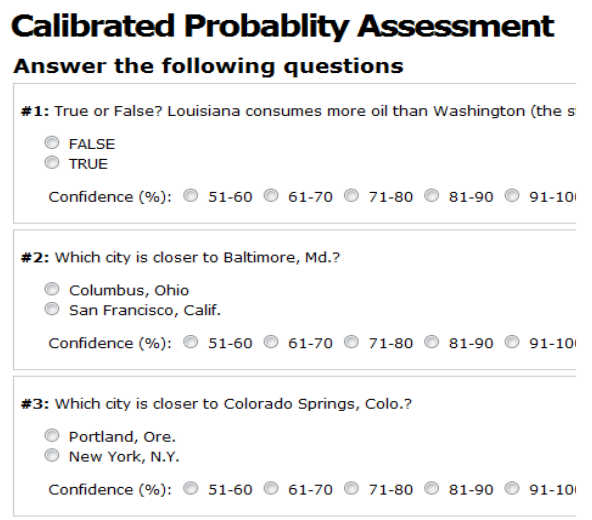
Once it was decided that an internet based survey was the best way to find a suitably large number of subjects the challenge was largely a technological one. What method would deliver the best user experience, and therefore provide the largest number of well formed, well considered responses. There are already a number of similar websites, and they were approached for advice.
John Salvatier and Alex Loddengaard kindly donated the code behind their website http://calibratedprobabilityassessment.org (Salvatier & Loddengaard, 2008) as a foundation for this project. The website asks a series of questions, each with two alternative answers. These are then qualified with half-range probability assessments i.e. from 50% upwards.
The questions are discrete propositions with two alternative answers. They are a mixture of general knowledge questions and comparative distances between North American cities. The questions have been criticised (McCabe, 2009) for being too USA specific, but the general premise is an excellent starting place for this study.
As the Calibrated Probability Assessment website’s primary goal is to assess general calibration, there is no specific focus to the questions on any particular topic.
As the intended audience for the proposed questionnaire is architects[13], and the purpose of the test is not to assess general calibration, but to test for specific calibration about a particular subject. A question set was developed that addresses the need to have subject specific questions taken from several relevant sources.
It will be interesting to see if the industry specific calibration correlated with general calibration as (Lichtenstein & Fischhoff, 1977) suggested, but the existing question set is very USA specific, and is therefore not necessarily a good indication of British subjects’ calibration. (Gilovich, Griffin, & Kahneman, 2003) mention that calibration is related to familiarity (recognition heuristic). With a USA biased question set the recognition heuristic may unduly bias the results. If a suitably geographically unbiased set of questions were found it would be very helpful to be able to compare general calibration with expert/field specific calibration, although with a finite attention budget to spend, the expert calibration is the most important thing to focus on at the moment.
Subdividing the population
 Due to the automatic marking of the questions and their aggregation there is essentially a zero cost to extra data collection. This is extremely beneficial as it allows for a huge amount of data to be collected, but it poses challenges as to how to sort that data. The first section of the questionnaire requires the subject to fill in some details.
The following fields are required before the subject can move onto the next section of the quiz.
- Role: Student, intern, assistant, associate, director, owner
- Field: Architecture, engineering, product design, policy making
- Age: 18 - 90
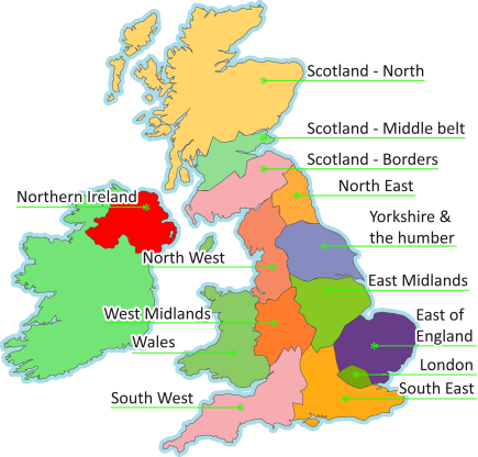
- UK region: see subdivision on the map.
- Country If not UK based
These classifications are used to allow the data to be subdivided into sets. It then becomes possible to see if engineers are differently calibrated to architects, or if directors are better calibrated than students. Subset comparisons are shown in the results section.
There are also two optional questions here, email address and company. These aren’t for data slicing, but are there to allow the results of the test to be sent to the subject, and for them to receive a personalised email with their calibration information in it. That email will show them where they are positioned with regard to all other subjects, and then if they (and at least one other person) put in a company, then how they scored with respect to the other people in the company. This would of course be anonymous, it would simply show a position in a hierarchy, not specifically who is above or below.
This extra information will allow the data to be subdivided to show if directors in the north of England are better calibrated than assistants in the south, or if associates are more knowledgeable than assistants. More comparisons and views on the data are shown in the results section.
Data security & ethical considerations
As I am collecting data from people, and this potentially has implications for reputations, i.e. if a story along the lines of: “a recent study shows that all staff at practice X are extremely poorly calibrated” were to be released it could be very damaging. The data that is collected by the BPquiz website is sent to me, and if they request it, to the subject, as an email, and is stored offline. There is no requirement to provide an email address, and there is no way for participants to see each other’s contact details or names.
Once the study is over, the data will be anonymised, (company affiliations, and email addresses removed) and made public for other studies, or for data visualisations.
This is the data safety statement from the website.
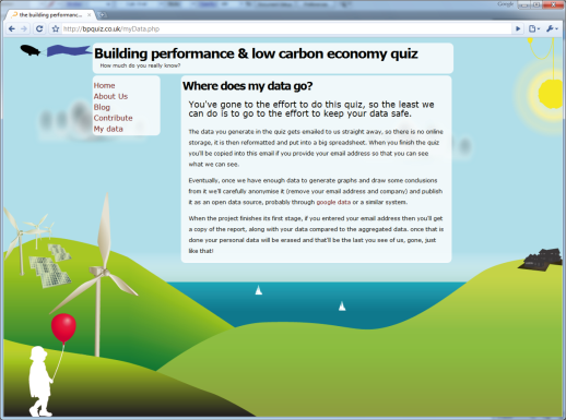
Where does my data go?You’ve gone to the effort to do this quiz, so the least we can do is to go to the effort to keep your data safe.
The data you generate in the quiz gets emailed to us straight away, so there is no online storage, it is then reformatted and put into a big spreadsheet. When you finish the quiz you’ll be copied into this email if you provide your email address so that you can see what we can see.
Eventually, once we have enough data to generate graphs and draw some conclusions from it we’ll carefully anonymise it (remove your email address and company) and publish it as an open data source, probably through Google data or a similar system.
When the project finishes its first stage, if you entered your email address then you’ll get a copy of the report, along with your data compared to the aggregated data. Once that is done your personal data will be erased and that’ll be the last you see of us, gone, just like that!
Buying time
Calibrated probability assessment tests usually require relatively large datasets before they are sure to return any meaningful results. Also to assess the state of an industry as a whole, a large number of samples from that industry need to be taken so that the law of large numbers helps to give an unbiased response. With this in mind, the test needs to be self propagating if possible, and the best way to do this is to provide something to the subject in return for their effort in filling in the form.
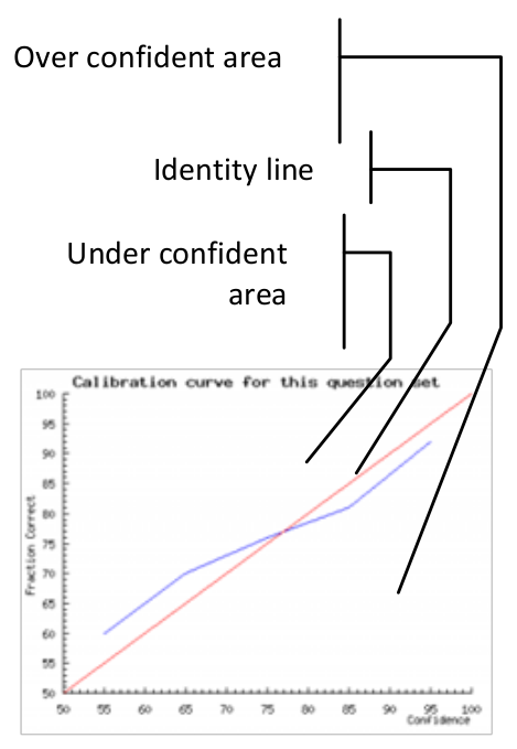
The graph shows a number of points, in this case six, spread along the horizontal axis (at 5, 37, 62, 87, 99, 100). The vertical axis plots the percentage of questions answered correctly at each confidence assignment. If a subject answers 10 questions at 87% confidence, and gets 7 of them correct, then the point will be plotted at 70%. The identity line would be plotted through the 87% point, so the subject’s point would be below the identity line. They predicted that they would get more correct than they actually did, and therefore they are over-confident. I.e. overconfidence shows as points below the identity line.Once a subject has responded to the questions they will, quite justifiably, want to see some sort of reward. The calibrated probability assessment website does this by providing a graph that describes the calibration of the responses, plotted next to an identity line. The identity line is the line that runs through the points that a perfectly calibrated judge would have chosen. If a subject’s curve runs above the identity line, then they are under-confident and vice versa. This is an unintuitive way for the graph to work, a more complete explanation of the graph’s workings follows.</p>
The BPquiz website uses the same graphing engine as CalibratedProbabilityAssessment.org to display the calibration graph.
This test uses field specific questions, rather than general knowledge questions, and as such there is an opportunity to provide feedback not only on the calibration, but also on the accuracy of the answers to the questions. It also shows the responses to the questions, marked correct or incorrect along with the confidence assigned as a way of giving something to the user in return for their investment in time.
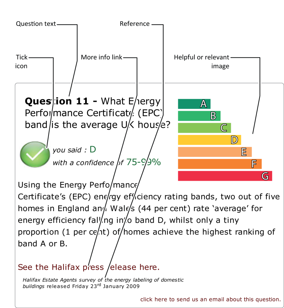
Once the full set of questions is answered, they are marked by some simple back end code on the site[14], and the calibration graph is drawn. The answers to the questions are also shown along with a brief explanation and a link to a source of more information. This extra information will hopefully build a feeling of good will with the subject, and they will respond favourably to a request to send it on to other people they feel that would be appropriate for the study.
Question sources
As I intend to study the gap between designers knowledge and the currently accepted ‘facts’, the source of the questions will be from sources such as the IPCC Fourth Assessment Report, and other similarly conservative sources. The main obstacle is avoiding questions that are ambiguous or are ethical judgements, i.e. climate change is: _a) bad b) very bad c) made up_, as these are issues of opinion and values, rather than objective questions.
Question design
Design of a questionnaire that will lead to good quality data is important. I will need to ensure that there is a range of probabilities that the subject can answer the question correctly. If the difficulty of the questions is too polarised then there will be no data space to explore. Difficulty is hard to assess from an _a priori _position, but in this study it is treated as the proportion of the population that get the question right. An easy question will have a high proportion of correct answers, and vice versa. The distribution of numbers of correct answers will be a shown as a graph in the results.
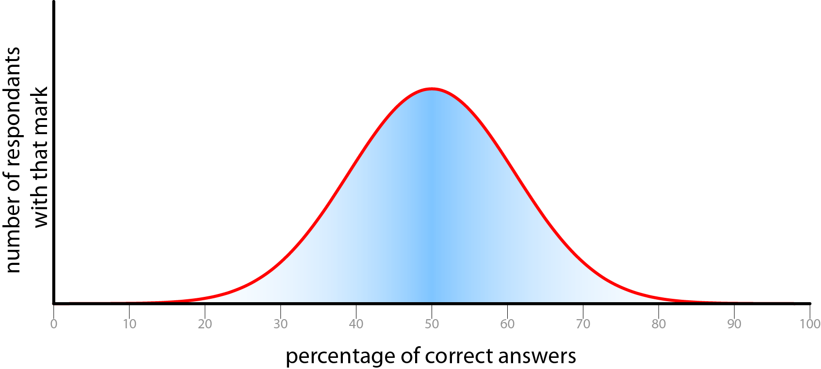
This graph shows the classic bell curve, also known as a normal distribution. This shows an idealised version of the distribution of correct answers. A measured distribution is shown in the results section.
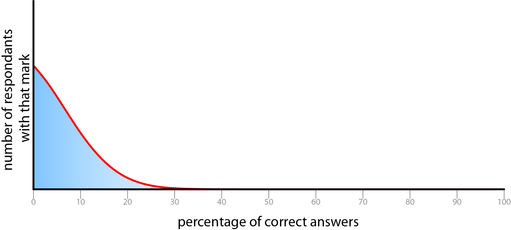
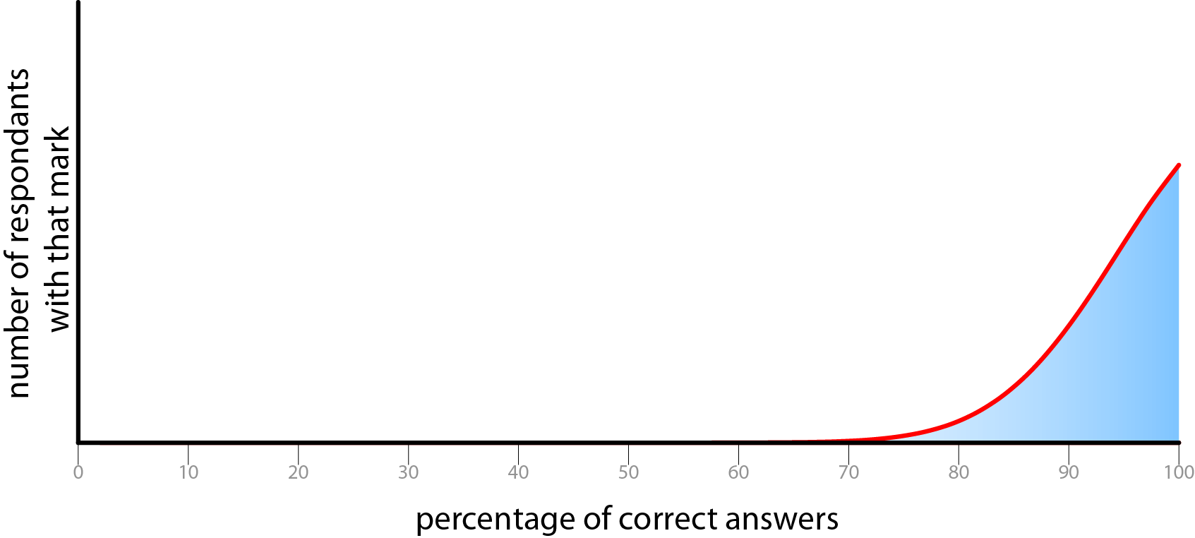
Possible undesirable distributions of correct answers.
The difficulty of the questions must be set so that it gives a good distribution of correct answers, If the results are too biased towards either end of the scale, or produce a spike of scores, then there is no way of extracting any meaningful data as it will be too tightly clustered to examine the differentiation.There ought to be a reasonable spread of results. This serves several goals. Firstly it makes the data meaningful as we can be relatively sure that we have captured the full range of respondents. Secondly, in order to make people forward this questionnaire to others, it is important that people will learn something, and feel good about themselves afterwards. These two aspirations are somewhat at odds with each other, as we have become accustomed to scoring in the upper half of a proportion of total marks. (UK university marking is banded <70% first class, 60-70% upper second class, 50-60% lower second class, 40-50% third class, and the majority of students score upper second class degrees.) This push to biasing the results towards the upper section of the range reduces the amount of meaning that can be gathered from the data, but makes subjects feel more positively disposed to the test. If people score only 50%, then they will feel as if they didn’t do very well, even though with a test at ideal difficulty, for a given set of subjects, 50% would be the average score.
The questions must be of a factual rather than ethical nature (MacKay, 2009) so that the ‘correct’ answer is unambiguous. They also need to be multiple-choice so that the problem of data analysis is tractable. If the responses were continuous quantities then the analysis would be considerably more difficult, and if they were of the ‘no alternatives’ type (i.e. ask the subject to answer the question without any options to choose from, and then assign a confidence in that answer) then they would need human interpretation, which would preclude automatic marking. There is no requirement for the answers to lie on a scale, or be sensible, as the analysis is interested in the confidence in the answer, not the answer itself. For example the following question is correctly formed.
How many watt hours does a 100w light bulb use in 1 hour?
- a) 100 b) cabbages c) apples
The correct answer is available, if the other answers are considered absurd then the subject should assign a 100% confidence to the answer they pick.
The questions that the results of the survey are hoping to answer need to be carefully considered before designing the questionnaire. Due to the broader subject of this work, transgressions of rationality will be all the more embarrassing for me. However, while bearing this in mind, as long as the study is constructed with respectable, well checked sources then there is no need for my knowledge to be a constraint on the content of the questions. Unintentional biasing will always creep in, all I can do is attempt to minimise it.
Example of interaction
The following is a run through of how a user would experience the website.
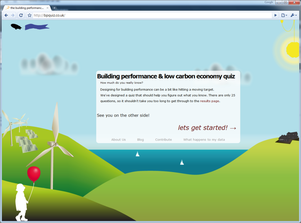
Front page
Gathering information about each subject
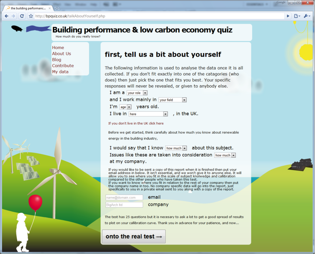
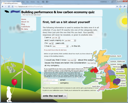
This stage has a reasonable amount of AJAX validation on the entries.
It also has a map that reduces ambiguity about which region the user is in. Oxford is a particularly good example of a place that is ambiguous in its location[15].
Question asking stage
The questions are stored in a database on the server. They are then delivered to the subject by a PHP[16] generated web page. The order was randomised to ensure that the order that the questions were written in didn’t affect the results, but are eventually delivered in a fixed order so that any biasing that comes from the ordering is constant across all results. The order of the answers is randomised. In the database the correct answer is always the first answer (a) and followed by three dummy answers, but when delivered they could take any order (i.e. c, b, a, d).
[This section is really image heavy, so I’ve put it here]
There is very little embellishment to these questions at this stage. Other than an AJAX[17] validation field to ensure that all questions are correctly filled in (i.e. both a response and a confidence are selected for each question).
Controlling for bias
CalibratedProbabilityAssessment.org has a lengthy introduction to why considering confidence is an important thing to do, and what the purpose of the site is. This was necessary as the site’s central theme is calibration assessment, and without it it would just be a banal trivia quiz. On the BPquiz.co.uk site, although calibration assessment is still the central intent of the site, it is possible to disguise this as a quiz about building performance and low carbon legislation. This meant that it was possible to get subjects to take the quiz without worrying too much about the underlying reasons for the confidence component.
As a part of the experimental design, it was considered important to control for the effect of the subject being asked to consider their confidence in each answer. It was decided that sheer volume of data was too precious to risk on making control study where the confidence section was left out, but a less dramatic alternative was put into place.
To fulfil the need for some sort of control study, after filling in personal details, 50% of the subjects were shown an introduction to the quiz that included information about calibration, and the remainder were only shown the questions. The half that were shown the calibration information were also shown their calibration graph at the end during the marking phase. This will show if being told about one’s calibration being measured has an effect on calibration or not.
Once the questions are complete the form is submitted for marking.
Marking and graph stage
[Because this section is all images, I’ve put it behind this lovely link!]
Marking is actually very simple, there is no ambiguity in the multiple choice questions, and if the correct answer is selected, then it is marked as correct.
The generation of the calibration graph is a little more technical from the point of view of implementation, but the user is not involved in this complexity. The calibration feedback does not yet use the Brier score (Brier, 1950; Murphy, 1973) as this is for giving an overall score to subjects’ calibration, and does not show if a subject is generally over or under-confident, just their variance from perfect calibration.
The method of marking in use simply plots a curve through the percentage of questions answered correctly at each given confidence. To explain this more fully, each question has an associated confidence, so they can be sorted into piles according this. The size of each pile is not actually relevant at all to calibration. These piles are then further subdivided into correct and incorrect answers. There should now be two piles of 60% confidence answers, and for a perfectly calibrated person, 60% of the answers should be in the correct pile and 40% in the incorrect pile. This should be the case with each confidence level, with p% of the answers correct when assigned a confidence of p.
The calibration graph
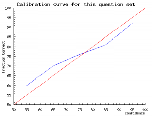 The red line is the identity line. This is the line that would occur if you were perfectly calibrated. The blue line plots through the subject’s actual results.
The data points that make up this graph are actually quite sparse. With only 25 questions there is a good probability that a subject will have only assigned a particular confidence to a small number of answers. A very small variance from perfect calibration can produce quite a large spike in the graph. For example, if a subject only assigned a probability of 70% to 2 out of 100 answers, and they got both of them right then they will see a large spike over 70% that looks very poorly calibrated (under-confident), whereas what is really happening is that the law of large numbers has yet to kick in and level out these anomalies. If the subject doesn’t assign a particular confidence value to any answer (i.e. if they didn’t use 50% confidence at all) during the quiz, then the graph will show a spike down to the x axis, this is misleading as it implies poor calibration, whereas really it just shows a lack of answers. If a subject had answered 1000 questions their calibration profile would be much smoother.
Social marketing
As an attempt to take advantage of the goodwill generated from people learning something, there is a small stack buttons to allow easy sharing to social web services.
Conventional marketing
It was planned to push the quiz through conventional media with the following press release. Ultimately this didn’t happen, but it will be one of the first steps of launching the revised site.
Building performance & low carbon economy quizHow much does the industry really know?
14/03/10 <for immediate release>: Oxford Brookes researcher Ben Doherty this Monday launches comprehensive survey into architects’ quality of knowledge about building performance and the low carbon economy.
This online quiz assesses architects’ decision making about issues related to building performance and the low carbon economy. The intended audience is practicing UK architects, those at the front line of design decision making. It is expected that the study will show significant overconfidence when it comes to addressing the rapidly evolving landscape of environmental legislation and technology.
Calibration is well established in business decision making, but in design it is very rare. Previous studies in other fields have shown ‘experts’ to be substantially over-confident, and the results are expected to be repeated with architects. Initial results from the beta stage have been promising. Ben Doherty says “designing for constantly shifting criteria is like hitting a moving target; hopefully this will provide a start on the road to a methodology for designing under conditions of extreme uncertainty. I expect that the results will show that as architects in general we know what we are doing, but when it comes to important details our confidence will be shown to be misplaced.”
“fascinating. I like the degree of confidence feature”
“Doing the quiz was a lot of fun, there is a lot to be gained from this sort of thing”
Judit Kimpian – Head of sustainability at Aedas and leader of the Carbon Buzz project
<END>
Notes:
It is important the stress that this test isn’t about showing how stupid architects are. Stupidity and ignorance are very different things – ignorance is simply a lack of knowledge that can be remedied. Knowledge about the gaps in one’s knowledge is a very powerful thing as it allows assistance to be called on appropriately. This meta-knowledge reduces errors and embarrassing oversights.
The process involves asking a question and then an associated probability that the given answer is correct. Over a large number of questions a well calibrated person should expect to get 70% of the answers they assigned a 70% confidence in to be correct. If they get more than 70% correct then they are under-confident, less then they are over-confident. Historically ‘calibrated probability assessment’ has its roots in weather forecasting, where meteorologists have been assigning confidences in their decisions for over a century.
It is hoped that the results of this test will provide a source for reflection on appropriate confidence by the participants, and also provide a base for further research into how to design under conditions of extreme uncertainty.
Generation of new questions
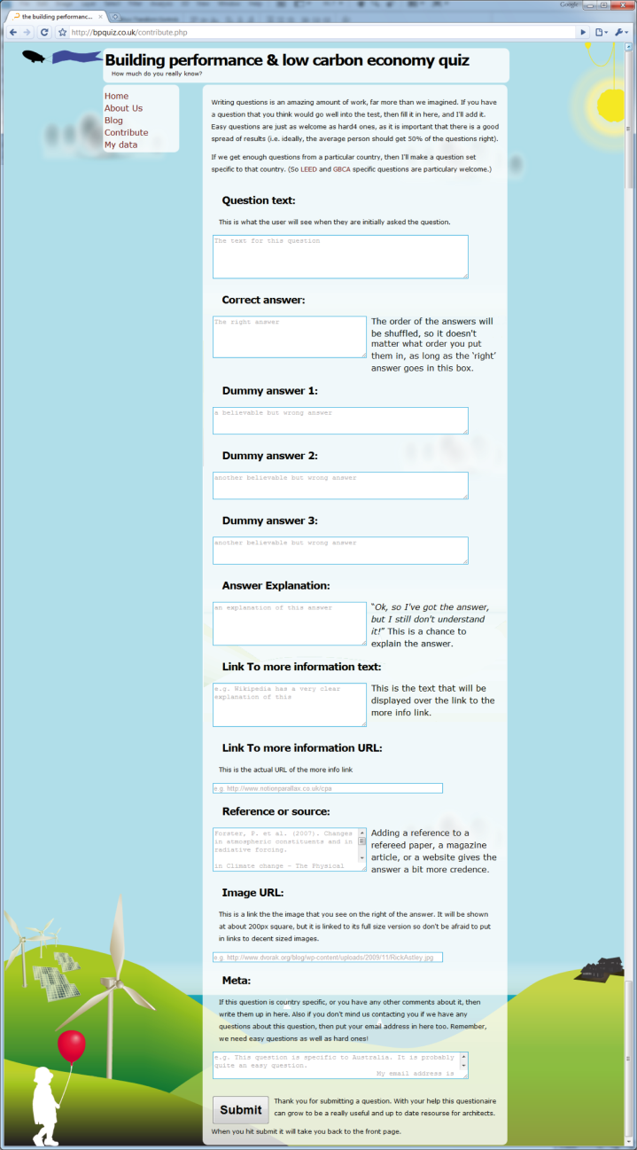
Generating questions is a time consuming activity, to help reduce the amount of time spent generating the questions for the next generation of the quiz a page allowed users to submit a question of their own. This would also show what sorts of questions were interesting to the users.
More information
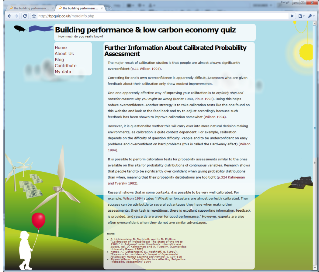
It is difficult to give more information without biasing the study. The page above shows the general ‘more information’ page.
This page is only available to those who have been shown the hint about calibration.
All papers cited on this page have their abstracts as AJAX tool tips to make it easier to expand the scope of knowledge contained within.
Limitations of research
There is a huge amount of work that I am planning to not do, and areas that have been avoided, this section will discuss these. It will also cover what I consider to be the weaknesses in both my skills and the proposed methodology.
What I’m not talking about
This work is too brief to discuss the general role of rationality in the design process. The usefulness[18] of decision analysis methods like building decision trees (Aczel, 1989), or adhering to the axioms of probability theory (Allingham, 2002) seems intuitively great. After all, well-resourced financial institutions use these sorts of scientific/econometric management methods to design strategies and products, so why not use them to manage the design process? There may well be other costs that make it unreasonable to use the standard tools of rational decision making.
The human brain is incredibly adept at harnessing heuristic methods to synthesise large volumes of data into a design. These heuristic, or ‘rule of thumb’, methods allow the brain to turn what may initially seem to be disparate sources of data into mental libraries of information, and then ultimately martialing that into knowledge to solve a problem. These methods often far exceed the capacity of complex computational algorithms on many classes of problem.
Searching for a solution to a problem is something that designers do intuitively, but as computers have no intuition more needs to be done to enable them to be helpful. Initially one might imagine that the enormous speed of modern computers would allow them to grind through problems incredibly quickly and find good solutions in a morass of other possible solutions. A bit of simple combinatorics shows how this can go wrong. If each possible solution takes one second to evaluate, then if you have one possible parameter to the solution, and that can take eight possible discrete values (i.e. the numbers 1-8, or 8 different colours, or 8 different sizes of beam) then the solution would take eight seconds to evaluate. This amount of time seems pretty viable, but as we add more parameters, each with eight possible values then the amount of time required to evaluate them rises very steeply. By the time that there are twelve variables it would take over 2179 years[19] to evaluate all of the solutions (Doherty, 2009)!
This massive expansion of possible solutions is impossible to handle without some sort of method to direct the search. There are well established methods that come mainly from the field of artificial intelligence, but often a combination of a well calibrated human directed search augmented by a computational system is most effective.
Problems where the inputs are largely qualitative in nature, or where there are very few inputs (usually under six) are often readily solved by mental heuristic methods, whereas problems with quantitative inputs or a very large number of input factors are often best handled by a computational model. (Ayres, 2008)
Both human decision making, and mathematical models are subject to retrospective “tweaking” (Roberts & Ayres, 1999) or post rationalisation to make them conform to the ‘intent’ of the person using the decision method. The computer models that we see are usually the final attempt at making them fit the empirical data, rather than the first – there may well be other configurations of variables that fit the model even better, but the current set ‘will do for now’. The same can be said of human decision making, post rationalisation is often used to make an outcome appear more appealing, or fit the current paradigm.
Metrics for solutions to design problems in architecture are often qualitative. For example, how does a space feel? However more problems than might initially be thought could be handled using numerical or other more managed methods. In the above example of the ‘feel’ of a space, there are a lot of factors that can be quantified, acoustic reverberation time, temperature, air movement, visual access and many others. With this information provided to a human designer, they are in a far more informed position, and hopefully able to make better decisions. For more of this, see decision support systems in the proposals section.
I have found little work on the role of rationality in the design process. Regardless of this, I believe that it is likely to be found to be a fruitful area for further research.
Weaknesses in my skills
I am essentially a fascinated tourist in the realms of cognitive psychology, mathematics and economics, my main realms of knowledge (if I can claim to have any at all) are architecture and computation. This means that as I blunder, wide eyed, through these areas that there is a strong possibility of missing valuable gems of information just off the beaten track.
The main places where there is potential for compromising the outcomes of the study are in the experimental design and, then once results are collected, the statistical analysis. The study’s analytical approach was discussed with Erika Ammerman, Consultant Research Manager at the Nielsen Company. Her input has helped me avoid a great many pitfalls. Hopefully the data will submit to relatively naïve analysis, and provide usable information despite my lack of statistical skills.
Weaknesses in the methodology
Unless a suitable large sample set is found it will be very difficult to extract any information from the data other than some very naïve answers. For example, if half the population are initially shown the calibration information, half the population are architects, a quarter are directors, and half the directors are over 35, then in order to look at sample that satisfies all of those criteria (“shown info” AND “is architect” AND “is director” AND “>35”) then this becomes 0.5×0.25×0.5×0.5=0.031. What this means in reality is that in order to get a useful sample size (say, at least 10 subjects) this would require a population of at least 300, and the numbers chosen above are very optimistic (chosen for ease of mental arithmetic, not to be representative of reality). A sample size of around a hundred should provide a robust base to show if this is a fruitful field of study.
The same challenge applies to the number of questions asked. This is a trade-off between gathering really good data, and gathering a lot of data. If subjects are presented with a hundred questions, then a quite accurate picture of their calibration is likely to emerge, if they complete the test. If a test takes longer than ten or fifteen minutes to complete then a large proportion of potential subjects will simply not finish it.
The lack of an absolute control group where no mention of calibration is likely to make any conclusions drawn from the study difficult to position in reference to anything else. If the study shows that the population is actually under-confident then it will be impossible to separate out the nature of population from any bias induced by the quiz. If a control were to be added in a future version, it would be very difficult to market the quiz without forewarning subjects about the nature of the quiz.
There is currently no method of measuring how long each subject spent on the test section; it would be interesting to see how this affected calibration and accuracy. This would be an easy feature to add in future iterations.
There is currently only limited checking for duplicate responses. This is based on searching for substantially similar responses, mostly manually. Tracking the subject’s IP address would add an extra level of depth to this search.
As there was no substantial testing of the questions for experimental bias, there might be a tendency for certain questions to elicit certain responses. This is mitigated to some extent by an identical question set being used for all subjects.
There is almost certainly going to be some selection bias in the results. Amongst other things, the subjects will not be randomly selected; people I know personally are more likely to respond; certain types of people might frequent the sites where links to the questionnaire are; and only a certain type of person will actually have the patience to actually take the quiz!
It is also impossible to rule out ‘plain ‘ol cheating’ peoples deviousness knows no bounds. It is possible to go through the quiz, and then use the answers given at the end to fill the questionnaire in to gain a higher mark.
Case study – Carbon Buzz
In order to be well calibrated one needs something to be calibrated against, a source of knowledge. Carbon Buzz provides this and shows that in general we are less well calibrated than we thought we were.
“Carbon Buzz emerged from a realisation that the construction industry suffers from a poor awareness of the link between CO2 emissions and the energy use of buildings.” (Kimpian et al., 2008)
Carbon Buzz is a web platform that provides architects and services engineers with a way to benchmark their projects against other real projects in terms of CO2 emissions. The project was initiated in 2008 as a collaboration between and the Chartered Institution of Building Services Engineers (CIBSE), the Building Research Establishment (BRE), the Royal Institute of British Architects (RIBA), and a number of architecture and engineering practices.
 As it is organised and partly funded by architects and engineers, and partly by government grants, the potential for bias introduced by political or commercial pressure is low. The main incentive for the platform’s existence is that it will result in better designs.
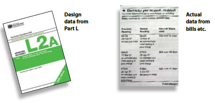
Currently the majority of assertions about a building’s predicted performance are made with reference to a notional building. The notional building is defined in Part L of the UK Building Regulations (section 1, paragraph 22). It is essentially a version of the actual building being designed, substantially simplified ready to be analysed by the Simplified Building Energy Model (SBEM) software. There are a lot of factors that are deliberately left out to simplify simulation.
The energy performance certificates (EPCs) are based on notional modifications to a notional house. The display energy certificates (DECs) are based on emissions, and therefore reflect the building’s real ‘in use’ energy consumption. This means that the DECs reflect the true performance of the building as an operational system, whereas the EPCs reflect only the building as essentially a vacant shell.
This allows comparisons between different buildings of the same type, and prompts interesting questions about why the performance of one building is different to another. For example, a comparison between two university buildings might show them to be quite different in terms of emissions. This would lead to an investigation into the causes of those differences. It may be that they are in different climates, or that they have different uses, obvious reasons for them to have differing energy consumptions. Where it becomes really useful and interesting is where the two buildings are essentially the same, if the energy use in one is substantially higher than in the other then it will prompt a more in-depth investigation into why that is. One may have single glazed windows, or a different specification of computers. It might be user behaviour, one space may have the cooling on and the windows open in the summer, or leave lights on during the day because the blinds are shut to avoid glare.
It would not be possible to make any of these comparisons without a benchmark to calibrate what a ‘usual’ amount of energy to consume actually is. The Carbon Buzz platform collects and aggregates information to provide this information.
Process
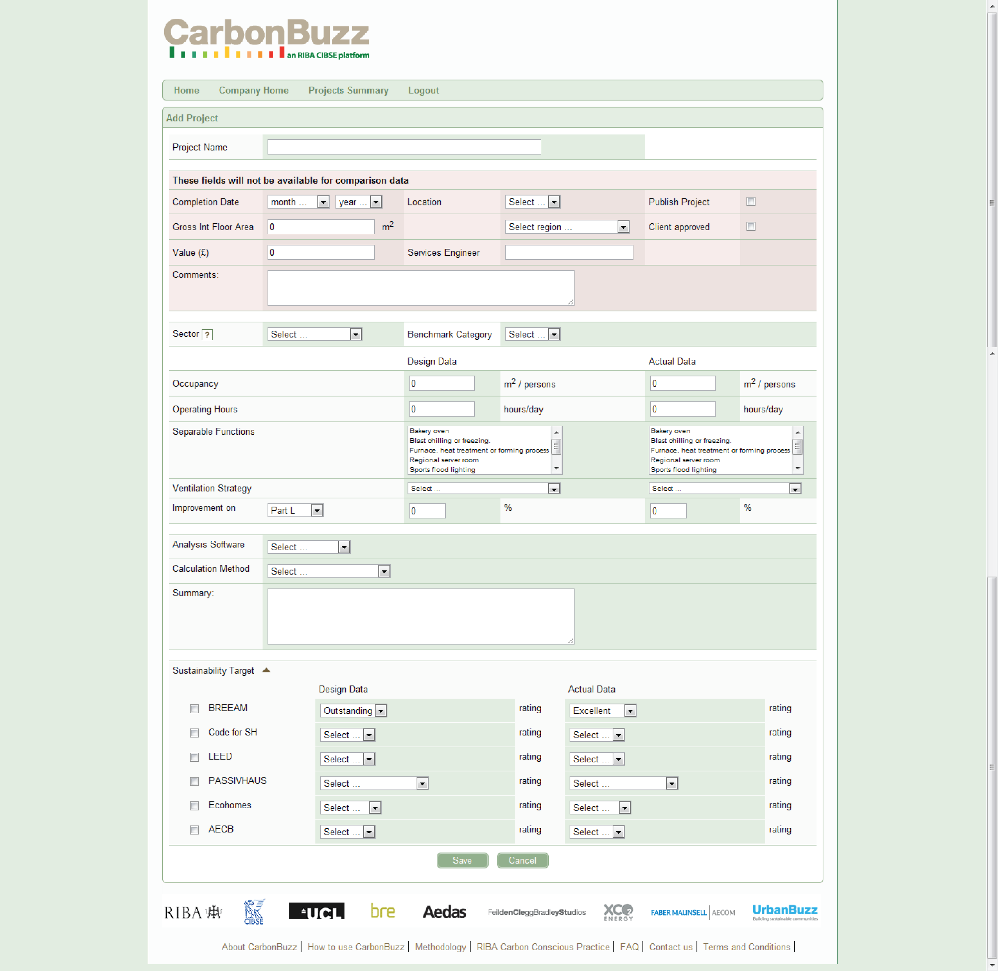
Once a user is registered with the Carbon Buzz website, they are able to start entering projects. Projects are entered into the using the form on the following page.
The form allows the user to record their predictions and then, once the project is in use, check them against real data. There are options to record things like occupancy which are not covered by conventional simulation as they are usually considered to be inputs. As these are recorded, then over time it becomes possible to see if the models are being fed relevant data.
There is also a section to record aspirations about what “sustainability target” the project is aiming for. The projects ultimate rating is then recorded once it is assessed. Over time any discrepancy between the two may start to show interesting results.
Results
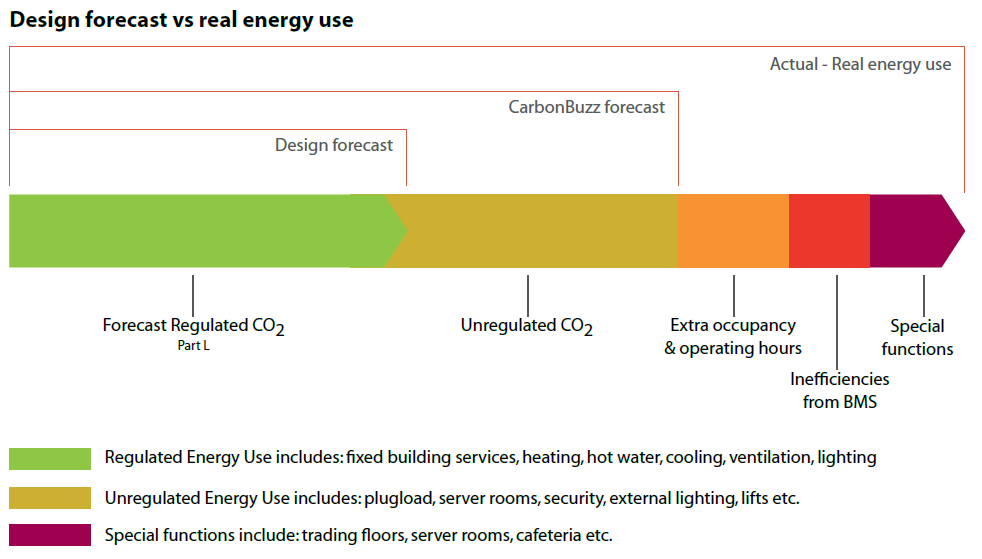
[I]t’s [the discrepancy in the predicted and actual data] based on the analysis procedures we use to forecast energy consumption, hence they miss a very large bulk of real energy consumption that’s related to user behaviour. So we drafted a big graph which, the graph itself became quite popular because it showed that you start with a part L calculation, and on top of that comes the unregulated energy use – which is everything that people plug into the wall – and on top of that comes any special function that people add to a building, like a cafeteria, or some ovens, or schools or kilns, or a trading floor for a prestigious office block, which all bring huge repercussions, and then things like the building management systems, so who, and with what expertise, is looking after that system, lots of things depend on that. Also the occupancy, so we design buildings to have a certain kind of occupancy and operating hours, and those tend to distort really quite drastically during a buildings life, and we actually don’t really design buildings for that sort of resilience. Which is a shame, and essentially the result of this is that the way we design buildings as a profession completely overlooks the majority of the energy consumption for buildings in use, and that’s an incredible lost opportunity for the industry.So Carbon Buzz is able to highlight these discrepancies, and make it very obvious and easy to read.
(Kimpian & Doherty, 2010)
Once the project data has been entered, the platform provides a dashboard that reports the difference between the predicted and the in-use energy, and also against the emerging benchmark values. As these benchmark figures come from an aggregate of the real projects submitted, they are representative of reality. Therefore if your project is under the benchmark then you can be genuinely pleased.

The ability to compare one’s predictions to the real measured outcomes is useful, but with the addition of the ability to compare with the rest of the industry will become incredibly powerful once the data set becomes larger.
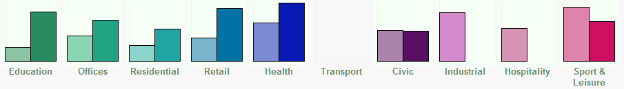
In the above graphs, the left column is predicted energy use, and the right actual energy use. On aggregate, projects are actually consuming between 4 and 11 times more energy than they were predicted to at the design stages. This is mainly because the model that is used to predict emissions is the standard Part L calculation. That describes the most basic case of the building, but then layered onto that is unregulated energy use (plug loads), special functions (a cafeteria, trading floor in an office building, kilns in a school). The other significant factor is occupancy, buildings are often simulated with quite limited occupancies; i.e. a school might be simulated between 9am and 3:30pm which doesn’t take into account the adult education classes in the evenings.
Reception
Carbon buzz was launched through a series of workshops at the RIBA and the Building Centre in London. People came and used the system to enter their projects, and just to explore the potential that the system had.
“I never really thought that data could be so interesting to people that were actually so interesting themselves”
Judit Kimpian
It seems that people are interested in data, and in what that data can tell them. Designers seem to be tired of just guessing, and a chance to really know what they are talking about seems to be very attractive.
There has recently been a survey of Carbon Buzz users, and the majority find the service extremely useful. It allows designers a better understanding of the real, in use, performance of their proposal, and gives a much better starting point for collaboration with consultants like services engineers. Knowing the right questions to ask can lead to a much more fruitful relationship.
Carbon Buzz has recently received a further three years of funding from the Technology Strategy Board (TSB) which will allow it to grow and develop new capabilities. A PhD candidate has just been appointed to start work on the role of feedback in design, and by the end of that period there should be a wide range of new features and facilities that the platform can offer. Eventually the platform will be able to be used to manage a practice’s project footprints, allowing designers to see what worked well, and what was less successful. It will also have amassed a huge database that will be extremely useful for data mining to find trends or to extract meaningful relationships between factors that we had not previously considered.
Conclusion
I found it very strange that I found it so difficult to write in an interesting way about a project that I am so excited about. Eventually I realised that this was because at its core Carbon Buzz is a very simple concept that is cleanly executed. Providing a way of recording project data, and contributing to a growing pool of knowledge seems like such an easy win that writing about it almost seems patronising. The really amazing thing is that it hasn’t been done before.
If practices continue to adopt the platform as a way of managing their project footprints then there is a good chance that this kind of review process will become the norm, hopefully resulting in a reduction in overconfidence about the performance of the buildings we design.
Result analysis
In the month since launch, the BPquiz.co.uk website collected 122 results. Of that, 98 were well formed[20] and unique[21].
Accuracy
The intended average score was 50%, and the aggregate score overall was 51%. This correlation is more a feature of luck than judgement as no difficulty analysis was done on the questions before the test was launched.
The distribution of correct answers is fairly even too. There is a slight bias to the right, but it is hard to say if this is significant.
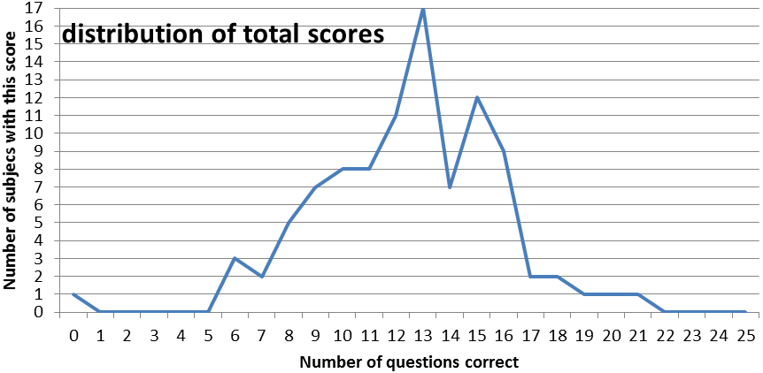
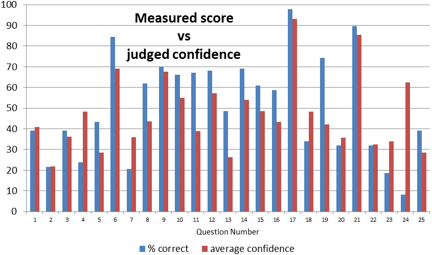
- What is the UK carbon abatement (CO2 emissions reductions) target for 2050? (As a percentage of 1990 emissions.)
- How fast are isotherms (lines of equal temperature around the globe) currently moving pole ward?
- Mass for mass how many times more potent as a greenhouse gas is methane than carbon dioxide?
- How many square metres of crystalline photo voltaic cells would power a normal house on a sunny day?
- What is the maximum grant (in £) that a home owner could receive as a part of the Low Carbon Buildings Programme (LCBP) Phase 1?
- What is a 'Feed in Tariff'?
- How many homes would a 5 megawatt wind turbine power if working at full capacity?
- Albedo is a measurement of the rate of what?
- In what sort of climate is it ideal to have large amounts of exposed thermal mass?
- Using one joule of energy in one second is how many watts?
- What Energy Performance Certificate (EPC) band is the average UK house?
- What is a Trombe wall for?
- The Met is a measurement of metabolic rate. Assuming that you are sitting fairly still at your computer how many Mets are you generating at the moment?
- For a given thickness which is most insulating?
- What percentage of domestic energy is used for space heating?
- What is the payback time for energy saving light bulbs?
- What chemical compound does CO2 refer to?
- What fraction of the current UK housing stock will still be here in 2050?
- What is the EU 2020 renewables target for the UK? (as a percentage of all energy generated)
- When will the Carbon reduction commitment come into effect
- Which of the following is not a fossil fuel
- How many times more efficient is an A+ rated fridge-freezer than a G rated one?
- In this realm what does the acronym PMV stand for?
- Where does the most heat escape in an average home
- How many Terawatts of power did the world consume in 2005?
A full list of the questions, their answers, and other associated questionnaire information is in the appendix.
Question difficulty
Although probably quite a naïve definition of difficulty, I am taking the population’s ability to answer the questions correctly as a measure of how hard they are. It is interesting to see that in general the questions are of roughly equal difficulty.
Questions that were anticipated to be easy like ‘What chemical compound does CO2 refer to?’ and ‘Which of the following is not a fossil fuel?’ received correspondingly high percentages of correct answers.
Question 24, ‘Where does the most heat escape in an average home?’ (Correct answer, through the walls) was considered to be a slightly unintuitive question (hot air rises etc.), but one that should be relatively common knowledge amongst architects. It attracted a surprisingly low percentage of correct answers with the majority of people choosing ‘roof’ with a high degree of confidence. This shows an unexpected use of tests like this – showing up incorrect ‘facts’ that are commonly held.
The other interesting discrepancy is shown in questions 13 and 19, “The Met is a measurement of metabolic rate. Assuming that you are sitting fairly still at your computer how many Mets are you generating at the moment?” and “What is the EU 2020 renewables target for the UK? (As a percentage of all energy generated)”. These both show very significant under-confidence. The correct answer to question 13 is “1” so it may be due to some sort of unconscious familiarity heuristic (based on my design of the answers) which subjects then overcompensate for and assign a low confidence. Question 19 is less clear. It is a fairly obscure question, and I had anticipated a low accuracy, but it had an extremely high number of correct responses. The confidence assigned was fairly low. Again, I would imagine that there is some sort of unconscious heuristic at play here which predicts what a reasonable number for the legislation would be, and then goes with it, but as the response is fairly unconscious it doesn’t elicit a strong confidence.
General calibration
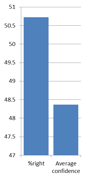
By comparing the overall average confidence with the overall percentage of questions correctly answered, a very quick, naïve analysis, it shows that the average confidence is actually lower than the percentage of questions that were answered correctly. The data seem to imply that architects are actually under-confident.
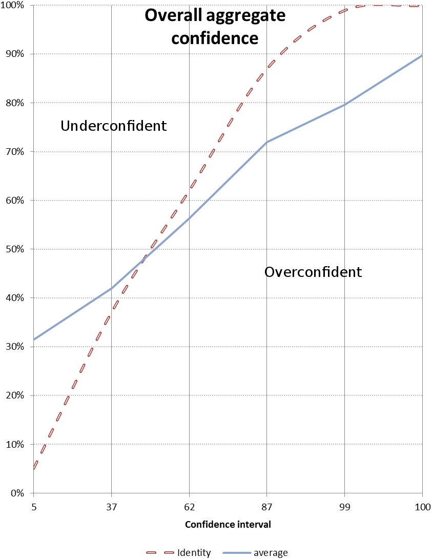 This seems to explicitly contradict the hypothesis that architects are over-confident. On closer inspection, there are a number of factors that could have contributed to this result.
The first of these, and the most obvious, is that the hypothesis is wrong. This might be the case, but I hope to show below that cannot be proven conclusively.
The graph on the following page shows a much more detailed evaluation of the aggregate performance of the population. It shows the percentage of correct answers at each confidence level. As has been mentioned before, for a perfectly calibrated judge the percentage of correct answers ought to correlate with the confidence assigned.
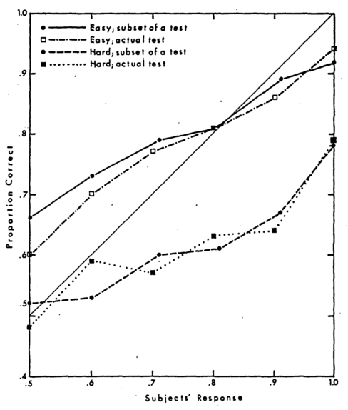
Calibration for hard and easy tests and for hard and easy subsets of a test. – from (Lichtenstein, Fischhoff, & Phillips, 1981)
The red dotted line is the identity line, the line that an absolutely perfectly calibrated person would plot. The blue line is the average of all the responses. Unintuitively, the area above the identity line is the under-confident region, and the area below, the over-confident region.
This graph shows that the subjects show similar confidence characteristics as shown in (Lichtenstein, Fischhoff, & Phillips, 1981 figure 3 - Calibration for hard and easy tests), namely that subjects tend to be over-confident with respect to difficult questions, and under-confident about easy ones. The 5% and 37% confidence partitions are in the under-confident area of the graph, and all others are in the over-confident section. (The 5% confidence value’s effect on the results will be discussed additionally later.)
The graph below shows the calibration curves for the whole population. It is a bit too crowded to meaningfully extract any information, but some more useful graphs follow.
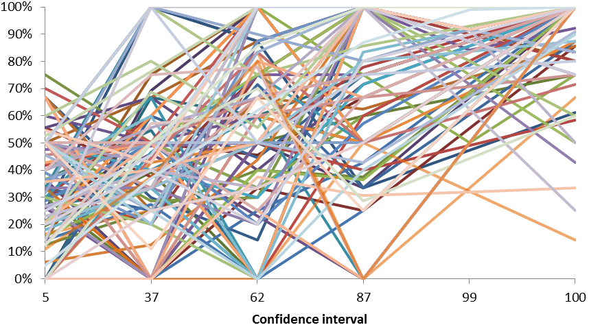
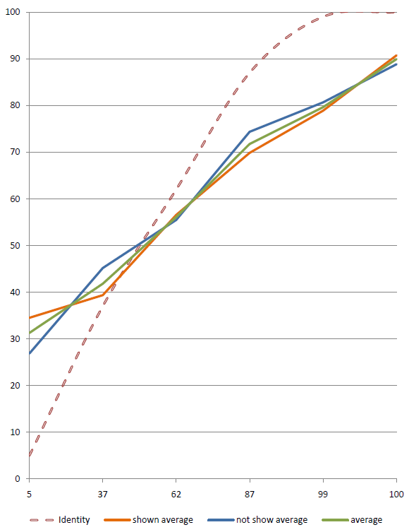
This graph opposite shows the calibration curves of two subsets of the population, the half that were show information about calibration before they took the text, and the half that weren’t told anything about the test’s interest in calibration. The overall average is also shown.
The two curves are surprisingly similar. As the samples sizes are relatively generous, there may be an appreciable difference at the bottom end of the confidence scale. Subjects who are shown the information seem to assign very low confidences more often to questions that they actually get right. This may imply that giving information about testing for calibration makes subjects slightly more cautious with low confidence answers.
The general similarity of the curves suggests that subjects either pay very little attention to the information that they are given, or that the information given has very little effect on their decision making. The former is worrying in that it implies that text that is provided to help in a web interaction context has little or no effect on the user, possibly because they are conditioned to look for the next button to click. The latter option is more promising, if being told that one’s calibration is being examined has no effect on calibration, it may be because calibration is a more stable property of a personality.
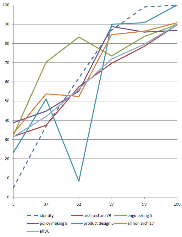
Field specific calibration is difficult to assess with such a small dataset, but even though the non-architecture datasets are small, they show some interesting characteristics. The engineers appear to be quite cautions, showing under-confidence all the way to about 70%. The product designers seem to actually be very well calibrated except for a very large spike at 62%, but this might be a single rogue value as there are only 5 responses. Policy makers also seem to be quite well calibrated through the middle section, but seem to be most under-confident about things that they know least about. Over all, the non-architects seem to be better calibrated than architects.
There are a number of possible reasons for this. The most glaring is that it could be a statistical anomaly due to the small sample size. The other issue is that most of the policy makers and engineers have some professional interest in being well calibrated. Personal communication with policy makers shows that a good proportion of them have worked on environmental policy in the last few years, and the engineers are making predictions for a living (much like weather forecasters).
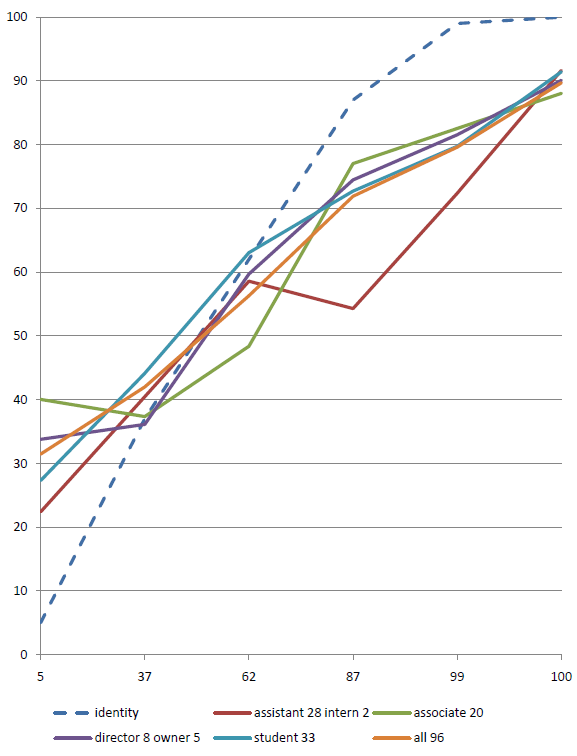
The graph below shows the various calibration curves for the different role subdivisions. The sample sizes are quite varied, and therefore the curves also vary in their stability. The curves for assistants and associates have relatively good sample sizes, but the curve for interns only has 2 responses to draw from.
The graph opposite shows the same data, but with directors & owners, and with assistants & interns merged. The curves don’t show a substantial difference, but directors & owners do seem to be the group that differ from the identity line the least. The large spike in the assistant & intern curve seems to be driven by one particularly over-confident intern as the spike is not evident in the assistant only curve.
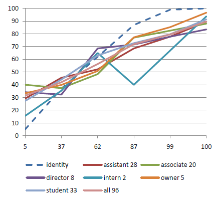
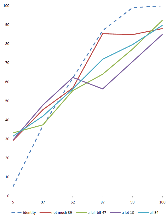

This graph shows the population’s calibration, subdivided by their prior opinion of how much they knew about the topic of building performance and low carbon economy issues. All subjects had been shown the same information by this point.
Those subjects humble enough to state that they knew “not much” actually have the most well fitting curve. It seems that humility is actually quite an important characteristic, those who said that they knew “a lot” had a narrower spread on the correct answer distribution too.
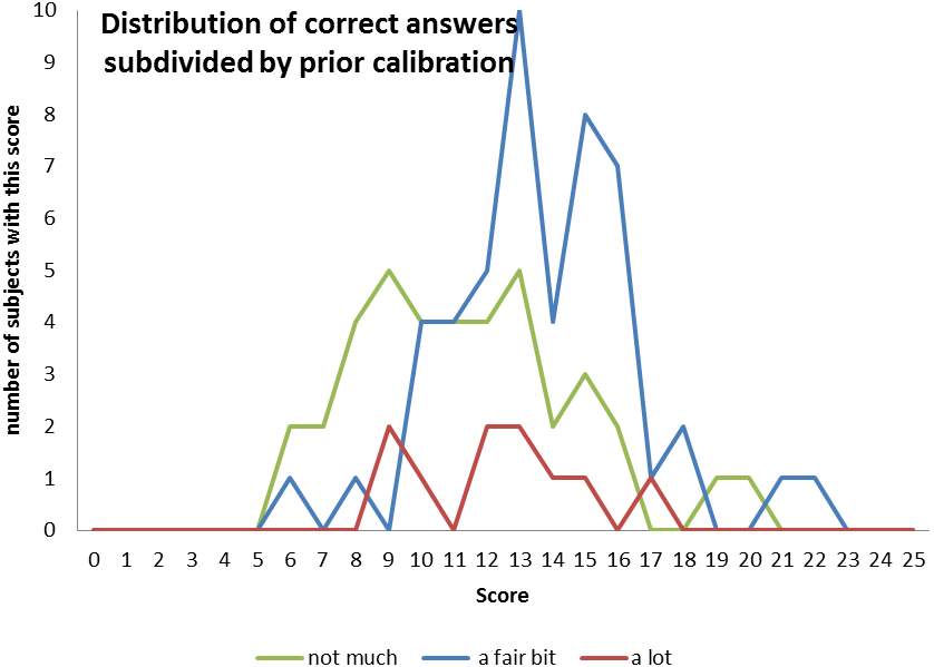
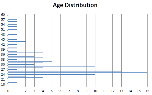
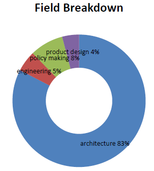
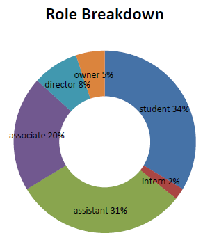
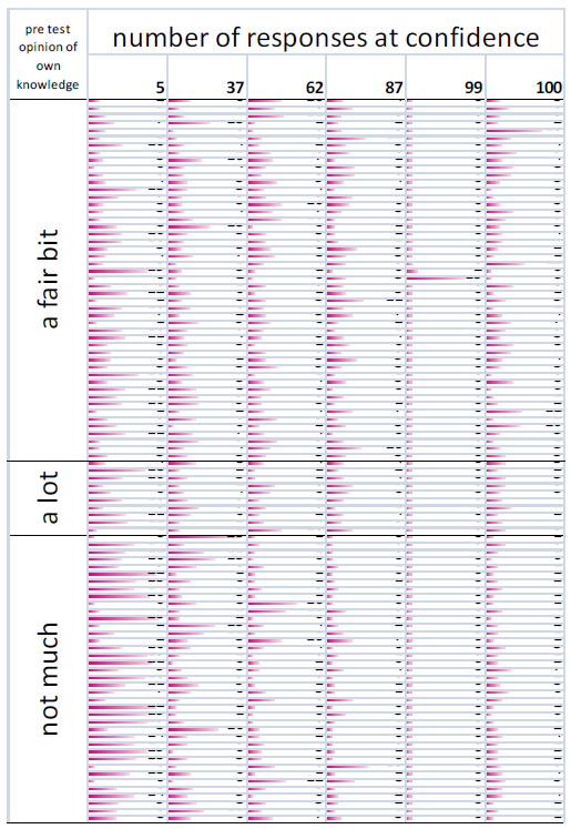
These graphs show the distribution of responses at each confidence level. They show that hardly any questions were chosen with 99% confidence, but many more were chosen with 100% (Di Finenetti would be very upset).
Marketing
This graph shows the number of responses received per day. It drops off gently after the quiz was launched, and then spikes again at the end when it was pushed again through directed emails.
Discussion
What do the results tell us?
In general, the results seem to show that the subjects showed over-confidence with regard to any question that they felt that they had a chance of getting right, and under-confident about questions that they felt that they were guessing the answer to.
The effects of the experimental bias introduced by the questions, and by the fact that people were being asked to consider their confidence probably pushes the data towards under-confidence, so ultimately people are probably more over-confident than this study shows.
What went right?
The response to the quiz has been generally positive. Subjects have responded that it was thought provoking and has prompted them to consider how appropriate their application of confidence is.
The Carbon Buzz interview was fascinating in itself, but also gave a chance to show the BPquiz site off. It prompted some interest in how this methodology might usefully be included in the platform.
What went wrong?
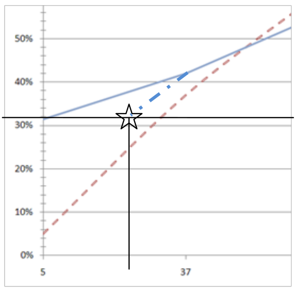
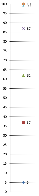
The distribution of the possible confidences leads the results to imply that subjects were much closer to correct calibration than I had hypothesised.
Probability theory dictates that if one of the answers is known to be correct, then the lowest possible confidence that can be assigned to an answer is 25% for a response where there is absolutely no preference between the answers. The provision of a 5% confidence to see if people realised this essentially was a free 20% shift towards under-confidence every time it was chosen, and as most respondents were over-confident, it biased their results back to the centre. The 5% was actually presented as under 25% so it could have been positioned anywhere. It would be interesting to see if this altered the results substantially.
A quick check (below) implies that even if the under 25% range was moved to 25% it would still have resulted in under-confidence for the questions answered with this confidence partition.
An unanticipated problem was caused by launching the site too enthusiastically and the server that was hosting the site was unable to keep up with the volume of requests. It is impossible to estimate how many responses were lost due to interested people not being able to access the site.
Further work
The factor that would benefit the study the most would be a larger sample size. With more data points the subdivisions of the data could be considered to be more reliable. As it stands currently, 8% of the responses are from director level subjects, which is probably about representative of the number of directors in the real world, but as there were only about 100 subjects, it is difficult to draw anything conclusive out of 8 responses.
It would also be interesting to broaden the study to include services engineers. As it is their job to make predictions about building performance I would imagine that they would follow the example set by weather forecasters and show reasonably accurate calibration.
It would be very interesting to add a section of general trivia questions as a repeat of (Lichtenstein & Fischhoff, 1977) paper “Do those who know more also know more about how much they know?” They tested a group of psychology graduate students to see if their calibration with regard to questions related to psychology (i.e. a subject that they could be considered expert in) was different to their calibration with regard to a set of general knowledge questions. They found calibration to be similar for both sets of questions. Would architects show a similar correlation between general knowledge and specific knowledge?
Prediction Book site.
It would also be interesting to investigate something that was brought up by one of the subjects, one’s confidence in not knowing.
Relaunch
Given all that has been learnt from the experience of performing this study it would be a shame to let this study lapse. As discussed above there need to be some minor changes to the experimental design, mainly to the website’s structure and the content of the questions, to maximise the value of relaunching the site.
A number of international subjects mentioned that they would like to do the quiz, but with a non UK specific question set. The site could be modified to deliver tailored question sets to different countries, but a general ‘international’ question set would be a strong building block.
The moving target
The quiz was published on the 8th of March, and even before the launch two of the questions had been invalidated. One by further research and the other by a policy change.
What fraction of the current UK housing stock will still be here in 2050?
- two thirds
- one third
- one half
- three quarters
By 2050, 31.8 million dwellings will be needed to meet the growth in population. This represents a net increase of 7.9 million homes (33%) from 1996. The stock increased by 1.1 million between 1996 and 2004, leaving 6.8 million to build between 2005 and 2050. Over two-thirds of the 2050 housing stock has already been built.
Read the Environmental Change Institute’s 40% House paper here. (Boardman et al., 2005)
The UK GBC published a report entitled “Low carbon existing homes” in October 2008 (UK GBC, 2008) about the proportion of the UK housing stock that will be extant in 2050, revising the estimate to be 80% rather than greater than two thirds as the 40% house paper had quoted (Boardman et al., 2005). The semantics of this would allow the question to be correct, but intuitively it is now wrong. (‘I am taller than 1cm’ is a true statement, but it is absurd since I have been taller than 1cm for a very long time!)
The cause of the Environmental Change Institute’s ‘40% house’ paper being more widely cited than the later UK GBC ‘Low carbon existing homes’ is unknown, but it may be that the figure in the ECI paper is derived from its constituent figures rather than just plucked from the air as it is in the UK GBC paper. It may also be that the 40% house paper was the first to make an impact, and then subsequent papers with less headline grabbing refinements to the initial value don’t get as much coverage.
When will the Carbon reduction commitment come into effect?
- 1st April 2010
- 1st August 2016
- 1st January 2012
- 1st October 2020
The CRC Energy Efficiency Scheme (formerly known as the Carbon Reduction Commitment) is the UK’s mandatory climate change and energy saving scheme, due to start in April 2010. It is central to the UKs strategy for improving energy efficiency and reducing carbon dioxide (CO2) emissions, as set out in the Climate Change Act 2008. It has been designed to raise awareness in large organisations, especially at senior level, and encourage changes in behaviour and infrastructure. The schemes amended title serves to better reflect the CRC’s focus on increasing energy efficiency.
The DECC website explains this (DECC, 2010b)
There is now a line on the website that reads “On 3rd March 2010 and 6th April 2010 a few minor changes were made to the user guide to bring it in line with the Order“(DECC, 2010a). Again the question isn’t technically wrong from a semantic point of view as the start date remains the same, but the ‘effect’ won’t be felt until the 30th of September.
The questionnaire was launched on the 8th, and I was made aware of the discrepancy on the 10th of March, but the DECC website had not been updated by that point. The source of knowledge was the cause of my error. One can think of this as an elaborate series of irrigation streams for watering crops, there may be more than one way for water to get to a field, but the largest channel (i.e. most common/ central source of information) will do the majority of water (knowledge) transport. If the main channel becomes polluted (isn’t filled with fresh or current information) then it will still provide the majority of the water. There may well be other ways to access the fresh water, but this relies on people realising that the main stream is not as fresh as it might be and searching for a fresher source.
This out of date information potentially caused a number of people reading the results of the quiz to either; learn something new; reinforce an existing mental model; revise an existing mental model to fit this misleading information; which, in turn, may spread misinformation more widely.
The example above can be considered to be an example of “negative learning” (Oppenheimer, O’Neill, & Webster, 2008). Negative learning is where continual refinement of a model leads to deviation from “the a posteriori right answer”. What this means, in simple terms is similar to a game of Chinese whispers. The example that Oppenheimer gives is the model of the chemical reactions that caused the hole in the ozone layer. The initial model proposed in the early 70s was reasonably close to the observed amount of ozone depletion, but in the following years the model diverged from what was really happening in nature for two reasons. One was that the priors, the information that was fed into the model, were not updated, the 1974 figures for halocarbon emissions were held constant when really they were increasing. The other was that as scientists refined the theoretical model of the atmospheric process at work, they missed a critical part of the reaction. There is a catalytic process which the early models didn’t take into account, and as such, the theoretical work produced a very accurate model of a process, but not the process in nature. This was then empirically shown to be wrong by satellite imagery, and the model was revised to fit the results by including the catalytic process.
If we are to design for robustness against change, then we need to take a stab at how change will happen. This is one of the key benefits of being well calibrated.
Proposals
What can be done to improve confidence calibration for designers to make designing easier, and to reduce the likelihood of errors? This section has some suggestions of things that could help.
Empirical observation
The simplest and most fruitful way to improve one’s calibration is to reflect on past judgements, and to analyse where things went right, and where they went wrong.
As we work, we generate vast amounts of data. Some of that gets turned into information. This is mainly how we turn work into money, by selling that information to others. Some of that information is actually useful, and gets turned into knowledge which can be thought of as experience as it was learned through doing rather than by rote.
The experience of a single person or company is worthwhile for them but, unless that experience is shared, it is lost in the long run. As the Carbon Buzz project is showing, the aggregated experience of a whole industry is far more useful. The aggregate knowledge will usually tend towards a good representation of reality (assuming that no negative learning is taking place). If your prediction varies significantly from that value then it will need a strong explanation of why this isn’t an error.
This reflection is a huge part of most other design disciplines. User testing is vital to ensuring that the prototypes that are produced really do what they are intended to do, before many millions of units are made. This suggestion is often countered by the assertion that, by its nature, architecture is prototypical, it is very rare that more than one instantiation of any particular design ever gets built. Although not identical, nearly all buildings are alike in some ways. So the lessons learned from one are applicable, to some degree, to the next.
Post design analysis, and post occupancy evaluation can answer questions that started life as just hypotheses. It can also show up properties of the design that are completely emergent, or unexpected. This could be errors that got through, either through a failure of the design process, or just down to the novel nature of the problem. It could also be unexpected good outcomes, like a courtyard that is particularly popular because it happens to get full sun at lunch times, or a part of the building process that went particularly smoothly because of an unintended, but replicable chain of events.
The design of the mouse is a wonderful example of feedback from users being considered an important part of the process. Douglas Engelbart developed the first mouse after a period of observing people working on computers and needing a way to move the cursor. Early mice were expensive and not especially robust; the early Apple mouse set out to change that. The sensor mechanism was developed that was cheap and easy to make, but when it came to the switch under the buttons their predictions about how many clicks the switches should be able to sustain were radically wrong.
“How many times will you be able to click it before it wears out?” I asked.
“Oh, these are the best; a hundred thousand times.” He replied
“A hundred thousand? That’s not enough! It’s got to be millions.” Bill couldn’t believe it; he thought that most of the time would be spent typing, and just once in a while you would need to point at something and click on it. Would that be every five minutes or once an hour?
“No, no!” I said, “Constantly, click, click, click, all the time!”
We grabbed a piece of paper and calculated the number of clicks and it was two orders of magnitude more. The switch would have lasted 2 weeks. They had to find a better switch, which raised the cost, but it was essential.
Larry Tesler explaining what he had learnt from user testing to Bill Lapson – the Apple project manager in charge of the mouse. In Designing Interactions
They filmed users interacting with the test system using a mouse, and counting how many times a minute they clicked. If they had gone to market with the predicted number of clicks then the product would have been a massive failure. The Apple mouse was the market leading mouse until the Microsoft mouse was released in 1987. Microsoft hired the people who would go on to become IDEO to develop a mouse that was “better than anything that had preceded it”. One of the most important parts of their design process was building prototypes and then getting users to test them. Bill Verplank developed a series of tests that allowed the designers to see exactly how their ideas performed. This resulted in the ball being moved forwards to under the fingers, and the left button being made larger. Without the feedback provided by the user tests none of this would have been possible. (Moggridge, 2006)
As a building is too expensive to make multiple prototypes of there is less opportunity to do a lot of user testing before the building is produced, but if each building is considered to be a prototype leading up to some hypothetical ultimate building, each project’s user testing can contribute to the über project.
“architects are really missing out on [an] opportunity by photographing their projects when they are complete but actually never going back and visiting them in use”
(Kimpian & Doherty, 2010)
Empirical observation is probably an overly technical term for what could be described as a ‘thorough debrief’. The debriefing process is important to capture all the experience generated during the project. This captured experience can then become a resource for others to take advantage of to allow them to develop the limits of the field without needing to construct the fundamental of that field each time (Kuhn, 1962). However much knowledge is made available, to others its status has returned to information. This information then needs to be reabsorbed and synthesised before it is useful, and there is no guarantee that hidden gems of advice will be picked up. This problem of lost knowledge leads us onto checklists.
Checklists
Checklists (also known as standard operating procedures (SOPs) or key performance indicators (KPIs)) are common in aviation, laboratory work and catering etc. Any scenario when there are definitely a number of areas that must be covered as an absolute minimum. Design of buildings is no different; there are certain legislative targets that must be met, and certain constraints that must be satisfied. Often the bulk of the creativity in the process is in taking an interesting approach to bending these constraints, but if they are made explicit then they can’t be missed by accident.
Checklist manifesto
Atul Gawande’s recent book ‘The Checklist Manifesto’ (Gawande, 2010) introduces checklists with two compelling examples. The first is the introduction of the Boeing model 299, which later became known as the B17 flying fortress. When it was first demonstrated in October 1935, the plane took off gracefully, displaying its superior power and engineering prowess; it climbed steeply, and then stalled and crashed. Killing two of the five crew aboard, including the pilot who was one of the army air corps most experienced test pilots.
The failure was attributed to pilot error, the plane was substantially more complex than any previous plane, and the crash was caused by the pilot forgetting to unlock some of the controls. A journalist reported it to be “too much airplane [sic] for one man to fly”.
A group of test pilots tried to work out how to overcome this complexity. They ruled out extra training as it was unlikely that the average wartime pilot could ever meet the skill level of a test pilot, let alone exceed it, and instead settled on a simple checklist that ensured that all the steps required to fly the plane had been carried out. This essentially shared responsibility between the pilot and the rest of the crew. None of the items on the checklist were complicated, but if any of them were missed it could be catastrophic. The checklist ensured that an absolute minimum standard was met or exceeded. Almost 13000 B17s were made, and then flew 1.8 million miles without accident.
The second example involves a less straightforward environment, but a very simple solution. A central venous catheter, otherwise known as a central line, is a catheter placed in a large vein, usually in the neck, chest or thigh. Because the line goes directly into the bloodstream there is a chance of infection. Peter Provonost, a critical care specialist at a hospital in Baltimore, wrote a checklist of steps that a doctor must take before placing a central line.
“Doctors are supposed to: (1) Wash their hands with soap, (2) clean the patient’s skin with chlorhexadine antiseptic, (3) put sterile drapes over the entire patient, (4) wear a mask, hat, sterile gown, and gloves, and (5) put a sterile dressing over the insertion site once the line is in.”
Page 37 (Gawande, 2010)
Nurses observed the doctors at work for a month, and in a third of cases at least one of the steps was skipped. The nurses were then given authority to stop a doctor if one of the steps wasn’t taken to ensure that each stage was completed. Incredibly, the incidence of infection due to central venous catheters dropped from 11% to zero as soon as this measure was introduced. The success was repeated in several other hospitals across the United States, which goes some way towards proving that it is not an isolated case.
Grimshaw architects use a checklist to help them start projects off
Checklist mentality
Both of these examples show improvements in situations where guaranteed adherence to an absolute minimum standard has produced a substantial benefit. Any attempt at an argument that building design is somehow of a different type of problem to surgery of flying a plane on the grounds of the complexity involved seems pretty weak. Surgery is at least as complex, if not more so that building design, the varieties of body shape make automated robotic surgery just as intractable as automatic building design. The real benefit of the checklist is that it ensures that nothing fundamental gets left out, and that gives a solid base for the artistry of the surgeon/designer to build from.
Checklists do have some negatives associated with them. In his documentary ‘The Trap: What happened to our dream of freedom – part one: Fuck You Buddy’ (Curtis, 2007) Adam Curtis explains Thatcher’s adoption of James M. Buchanan’s ‘Pubic Choice Theory’. By offering incentives to meet targets it was thought that the emotional aspect of decision making would be removed, and a rational system would move in to fill the vacuum.
The most harrowing example of this was in the Vietnam War where troops were required to submit a ‘body count’ but often they would make it up, or even kill civilians to meet their performance targets.
Alain Enthoven created a system of targets for the National Health Service. The idea was to free people who worked in the NHS from the top down leadership of the “old elites”. These new targets were intended to allow people the freedom to meet their targets in whatever way they liked, to have the opportunity to be creative and solve problems. Unfortunately the targets replaced a sense of ‘public good’ and to cut waiting lists, procedures that took less time were favoured over those that were most important.
The path of least resistance is shown again in ‘The Evolution of Evolvability’ (Dawkins, 1988). Dawkins tries to make his Blind Watchmaker program (a genetic algorithm) draw tall trees. The computer takes the target of being tall and meets it in the most efficient way possible, no branches! The target derails our intent by showing us where our criteria can be exploited.
The same is true of the current building regulations. Designing to meet building regulations is really producing the worst possible, lowest performance solution that will satisfy the regulations. Schemes like the BRE Environmental Assessment Method (BREEAM) in the UK, and Leadership in Energy and Environmental Design (LEED) in the USA have staged levels of compliance. These are aspirational targets which allow clients to decide what they would like to achieve. BREEAM is rated from pass, through, good, very good, excellent up to outstanding. LEED is classed as certified, silver, gold or platinum. A higher rated building will attract more rent, but will probably[22] cost more, so clients are free to balance these off against each other.
Staged compliance
The 2006 update to Part L of the UK building regulations introduced a number of reasonably big changes to requirements for building performance. These didn’t apply to projects that were already past the planning stage, but projects that didn’t get into planning by the cut off date often needed to be substantially redesigned to fit the more exacting criteria.
Returning to the theme of aspirational targets, these could be augmented along a time axis. Proposed legislation usually has a relatively long gestation period before it is confirmed into law, so a checklist can confirm that it meets or exceeds 100% of current minimum standards, and meets a proportion of the currently proposed legislation for the next round, but will have serious adaptability issues to meet what is proposed in the round of legislation after that.
Checklists don’t directly address the problem of overconfidence, but mitigate it by ensuring that an over-confident person has at least covered the basics. There might be several checklists, one for the whole industry, augmented with one for the company, and then another one for a particular team. The important thing is that they are simple, and only prescribe what is really necessary. Their pitfalls seem to be most prevalent when there is something to be gained by playing games with them, and in small organisations their intended use will override the temptation to design to fit the template as the output is all that the client sees, not a list of compliances, so should the product suffer, so would the business. It would be interesting to see what would happen if it was common practice to produce a minimum set of standards an aspiration to design towards, and not accept anything that fell below that.
Calibration training

PredictionBook screen shots
 Using checklists doesn’t do anything to address to root of over-confidence, and empirical observations are a very slow way of discovering the accuracy of one’s predictions. Betting on stock markets or horses is one way to test your calibration very quickly, but it requires a certain level of expert knowledge, and also discourages exploration of low certainty events. Explicit calibration training methods allow measuring of prediction specific to one’s field of knowledge.
Prediction book is a website that allows people to make predictions and state a confidence percentage in that prediction. This allows an idea of one’s calibration over time to be built up with reference to a range of real events. I.e. I may be very well calibrated about my ability to complete a particular grade of climb, but very poorly calibrated about the length of time to complete a list of features in a spread sheet. If Prediction book or something similar were to be used frequently then the user would quickly start to see feedback related to their confidence.

Wit and Wagers Board
How this translates into real world decision making is uncertain, but speaking from personal experience it has certainly made me more aware of confidence in my predictions. Whether this translates to that confidence being accurate remains to be shown, but an awareness is, at very least, likely to moderate any extreme errors of judgement. Wits & Wagers is a trivia game that is won not on the amount of trivia known, but by being well calibrated about the amount of trivia one knows. A question is asked and all players write an answer on a card and place it onto the table. Players then place bets on the correct answer - not necessarily their own. Points are earned by placing bets on the actual answer, which requires a judgement of confidence as applied to the complete set of answers available. Wit & Wagers is now available as an X-Box game, but the key component of having multiple human players is still present.
Prediction markets
“If you are so smart, why aren’t you rich?”
Edward Nygma - aka The Riddler 1992[23]

Prediction markets are similar to a normal speculative market, in that if you believe that the price of something is too low, you are invited to buy some of it, so when it is realised that the price is wrong and it goes up to a more representative level you make a profit. The difference is that with prediction markets, the tradable commodity isn’t gold or wheat, it is ideas.(Hanson, 1989; Hanson, 2008; Roberts & Hanson, 2009)
An example would be “The US Economy will go into Recession during 2010”, or “Crystal Bowersox[24] to win American Idol”, and if you believe that the probability that the market has proposed is wrong, you are invited to contribute to changing that figure by buying a bet. If you are correct, and the probability is wrong, then you stand to profit. Prediction markets have shown to be surprisingly well calibrated as prediction tools, as people are required to buy the right to speak as it were. If opinion is free, then it will be given freely, without much concern for its correlation with reality, whereas if it must be paid for, people are more likely to be choosy with how they spend their opinion (Sunstein, 2006). Prediction markets predicted Saddam Hussein’s capture[25] (Delaney, 2003), and are being used within commercial organisations (Microsoft, Yahoo, Google) to steer policy (Roberts & Hanson, 2009; Roberts & Sunstein, 2007). Sunstien’s work on Google’s internal prediction market is showing that the prices have near perfect correlation with the actual probability of the event happening.
Decision support systems
Decision support systems (DSSs) is a general name applied to any system designed to support a decision. These are generally, but not exclusively, computational systems. They emerged in the 1970s as computers developed enough power to bring interaction the main stream (Keen & Morton, 1978). The University of Eindhoven has been the home of DSS in architecture and planning since the early 1980s.
The simplest decision support system is asking for advice from a friend. That advice still requires some sort of assessment of whether or not to include it in your final decision. The ultimate responsibility lies with the human interpreting the results. The same is true of a computational DSS, it merely provides a recommendation based on some inputs, the final synthesis of that advice is down to the designer.
Some examples of the spelling and grammar checking in Microsoft Word.
A commonly encountered example of a decision support system is the coloured underlining in Microsoft word. If a word is thought to be incorrectly spelt, it is underlined in red, if it is thought to be grammatically incorrect then it is underlined in green, and if the word is correctly spelt, but it is an incongruous use of that word then it will be underlined in blue. If the user right clicks on the underlined word options to ignore or accept a suggested correction are given. The decision still lies with the user, but they are supported in making it by the computer.
An initial look at the literature makes the field look extremely impenetrable, but this is simply an illusion caused by the range of subjects covered being extremely broad. Any system that can support a human decision maker would count as a DSS, so this can vary from visual dashboard design for real-time data feedback to a system for modelling the behaviour of people in a train station.
Decision support systems can provide advice on complex subjects, which are difficult to grasp all the threads, or as in the case of the spelling and grammar checker, that are easily overlooked. They are not a replacement for designers, but are there to support them.
Conclusion
The results show that there is a distinct bias towards overconfidence amongst the architects surveyed. This alone probably isn’t a cause enough for concern, as a far wider survey would need to be taken to ensure that the bias in the survey isn’t to blame (I suspect the opposite is actually true), in addition to the data that the Carbon Buzz project has collected it seems that it is a phenomena worth paying attention to.
The specific causes of over-confidence are still unclear, but they can often be attributed to reliance on an out of date heuristics. The Carbon Buzz data implies that our mental picture of energy use is based on the most prevalent model, in this case the part L calculations. These calculations are not ‘wrong’, but they provide a picture that is a little more reassuring that it ought to be because they don’t remind us that they model only a very small part of the real scenario.
As information is a volatile commodity we ought to be careful while using it. The example of the proportion of the UK housing stock that will be extant in 2050 illustrates this difficulty well as the paper that superseded the 40% house information from 2005 was published in 2008. The difficulty stems from published material not feeding a central repository of knowledge; therefore there is no way to tell if information is outdated. Good calibration would allow a judge to decide if they ought to spend time searching for newer data. It would be useful if some form of decision support system was to be implemented that could answer these sorts of questions, but the challenge of creating a system that can respond to human language questions is nontrivial.
Checklists avoid some of the need to be well calibrated. The qualms about them leading to a mentality that designs to fit the criteria set out by the boxes are valid, but can be avoided by maintaining a ‘bigger picture’ view of the design process. The problems that checklists have run into before have often been because the checklist was the measure of success, and not the quality of the outcome.
As was shown in the example of designing a mouse, there is a need to be cautious of our intuition about the performance of our solutions. The designers at Apple got around this by user testing; creating verified knowledge through experimentation and prototyping. There is no good reason that architecture shouldn’t do the same. The current model used to predict building emissions has been shown by Carbon Buzz to be inadequate, but this doesn’t necessarily invalidate the model, just its use. If it is used by experienced engineers to predict the energy use they will compensate for its shortcomings, but by how much remains a dark art until there is good data available to calibrate against.
In our relationships with consultants being well calibrated can lead to engaging with people who have the expert skills that we lack early on before our own ignorance of that specific area becomes a problem. By getting their creative input, rather than just relying on the to bail us out of problems, a much richer product can result.
The most important thing that this study shows it that people are most over-confident about things that they are most confident about; therefore the more sure you are about something, the more suspicious you ought to be of it. Just having an awareness of calibration of a concept seems to be enough to have some effect on one’s overconfidence.
“The curious task of economics is to demonstrate to men how little they really know about what they imagine they can design.”
F A Hayek, The Fatal Conceit
We return to Hayek’s rather ominous quote from the introduction. It might well apply to designers of buildings just as much as it does to other fields. So perhaps if we have the humility to understand how little we really know about what we imagine we can design, then we can make a concerted effort to learn more, and design better.
Bibliography
(1989). Complete Business Statistics. Irwin Professional Publishing. Retrieved from http://www.amazon.co.uk/Complete-Business-Statistics-Amir-Aczel/dp/0071284931. (1961). Realism of confidence judgments. Psychological Review, 68(1), 33-45. Retrieved from http://psycnet.apa.org/journals/rev/68/1/33.
(1964). Notes on the Synthesis of Form. Cambridge, Massachusetts: Harvard University Press. Retrieved from http://www.amazon.co.uk/Notes-Synthesis-Form-Harvard-Paperbacks/dp/0674627512.
(2002). Choice Theory: A Very Short Introduction (p. 144). Oxford: Oxford University Press. Retrieved from http://www.oup.com/us/catalog/general/subject/Economics/Theory/?view=usa&ci=9780192803030.
(2009). Basics Design: Design Thinking: 8 (1 ed., p. 184). Lausanne, Switzerland: Ava Publishing. Retrieved from http://www.amazon.co.uk/Basics-Design-Thinking-8/dp/2940411174.
(2008). Supercrunchers. Bantam Trade. Retrieved from http://www.randomhouse.com/bantamdell/supercrunchers/.
(2000). Trading Is Hazardous to Your Wealth: The Common Stock Investment Performance of Individual Investors. The Journal of Finance, Vol 55(Issue 2), 773-806. Retrieved from http://www.jstor.org/stable/222522.
(2004). Data, Information, Knowledge, and Wisdom. systems-thinking.org. Retrieved from http://www.systems-thinking.org/dikw/dikw.htm.
(2005). 40% House. Environmental Change Institute, University of Oxford, 5. Environmental Change Institute, University of Oxford. Retrieved from http://www.eci.ox.ac.uk/research/energy/downloads/40house/40house.pdf.
(1950). Verification of forecasts expressed in terms of probability. Monthly weather review, 78(1), 1–3. American Meteorological Society. Retrieved from http://ams.allenpress.com/perlserv/?request=get-abstract&doi=10.1175/1520-0493(1950)0782.0.CO;2.
(1973). Quantifying uncertainty into numerical probabilities for the reporting of intelligence. Report R-1185-ARPA. Santa Monica, CA.
(1981). Physicians’s use of probabilistic information in a real clinical setting. Journal of Experimental Psychology: Human Perception and Performance, 7.
(1906). Forecasts and Verifications in Western Australia. Monthly Weather Review, 34(1). doi: 10.1175/1520-0493(1906)34<23:FAVIWA>2.0.CO;2.
(1906). Weighting forecasts. Monthly Weather Review.
(2007). The Trap: What happened to our dream of freedom – part one: Fuck You Buddy. Retrieved from http://en.wikipedia.org/wiki/TheTrap(television_documentary_series).
(2010). The CRC Energy Efficiency Scheme User Guide.
(2010). CRC user guide and guidance documents. Retrieved from http://www.decc.gov.uk/en/content/cms/what_we_do/lc_uk/crc/user_guidance/user_guidance.aspx.
(1988). Evolution of evolvability. In C. Langton, Artificial Life, SFI Studies in the Sciences of Complexity (pp. 201-220). Addison-Wesley Publishing Company. Retrieved from http://www3.interscience.wiley.com/journal/119081874/abstract.
(2003). intrade.com. Retrieved from http://www.intrade.com/.
(2009). Genetic Algorythms and Pirates. Delft. Retrieved from http://c-p.bk.tudelft.nl/events/Open Platform.html.
(2009). Logicomix: An Epic Search for Truth. London: Bloomsbury Publishing PLC. Retrieved from http://www.logicomix.com/en/.
(1981). The Pleasure of Finding Things Out. Horizon.
(2010). The Checklist Manifesto: How to get things right. London: Profile Books. Retrieved from http://www.amazon.co.uk/Checklist-Manifesto-How-things-right/dp/1846683130/ref=sr_1_1?ie=UTF8&s=books&qid=1271579585&sr=1-1#.
(2003). Heuristics and biases: the psychology of intuitive judgement (p. 59). Cambridge, United Kingdom: Cambridge University Press. Retrieved from http://books.google.com/books?hl=en&lr=&id=FfTVDY-zrCoC&pgis=1.
(1989). Encouraging an Honest Consensus. Extropy, 1-11.
(2008). Catastrophe, social collapse, and and human extinction. In N. Bostrom & M. Cirkov, Global Catastrophic Risks. Oxford: OUP.
(1976). Space syntax. Environment and Planning B, 3, 147-185. Retrieved from http://www.environmentandplanning.com/epb/fulltext/b03/b030147.pdf.
(2003). IPCC report.
(2007). IPCC report.
(2009). Nobelist Daniel Kahneman on Behavioral Economics. fora.tv. Retrieved from http://fora.tv/2009/05/15/Nobelist_Daniel_Kahneman_on_Behavioral_Economics.
(1978). Decision Support Systems: An Organizational Perspective. Addison Wesley.
(2006). Design Exploration through Bidirectional Modeling of Constraints. Design.
(2010). Judit Kimpian On Carbon Buzz. Notion Parallax. Retrieved from http://www.notionparallax.co.uk/blog/index.php/2010/04/judit-kimpian-on-carbon-buzz/#more-460.
(2008). Carbon Buzz Handbook (p. 38). London. Retrieved from www.carbonbuzz.org.
(1962). The Structure of Scientific Revolutions. Chicago University Press. Retrieved from http://www.amazon.co.uk/Structure-Scientific-Revolutions-TS-Kuhn/dp/0226458083.
(2001). The law of accelerating returns. KurzweilAI. Retrieved from KurzweilAI.net.
(1977). Do those who know more also know more about how much they know? The calibration of probability judgments. Organizational Behavior and Human Performance, 20.
(1981). Calibration of Probabilities: The State of the Art to 1980. Judgment under uncertainty: heuristics and biases, 306-354. Retrieved from http://oai.dtic.mil/oai/oai?verb=getRecord&metadataPrefix=html&identifier=ADA101986.
(2009). Sustainable Energy without the hot air.
(2009). Test Your Calibration! Less Wrong. Retrieved from http://lesswrong.com/lw/1f8/test_your_calibration/.
(2006). Designing Interactions (p. 766). MIT Press. Retrieved from http://www.amazon.co.uk/Designing-Interactions-B-Moggridge/dp/0262134748/ref=sr_1_1?ie=UTF8&s=books&qid=1271579334&sr=8-1.
(1973). A new vector partition of the probability score. Journal of Applied Meteorology, 12, 595-600. Retrieved from http://ams.allenpress.com/amsonline/?request=get-abstract&issn=1520-0450&volume=012&issue=04&page=0595.
(2008). Negative learning. Climatic Change, 89(1-2), 155-172. doi: 10.1007/s10584-008-9405-1.
(2008). The DeFinetti game. abstract confusions. Retrieved from http://guruparan18.wordpress.com/2008/05/10/the-de-finetti-game/.
(1990). Talks at the AA. AA Files, 19(Spring), p. 32. AA Publications. Retrieved from http://www.aaschool.ac.uk/publications/Main.aspx?sectionId=1&entryId=283.
(1999). Ayres on Data. Econtalk.
(2009). Hanson on health. EconTalk. Retrieved from http://www.econtalk.org.
(2007). Sunstein on Infotopia, Information and Decision-Making. Fairfax, Virginia: Econtalk. Retrieved from http://www.econtalk.org/archives/2007/05/sunstein_on_inf.html.
(2002). DoD News Briefing - Secretary Rumsfeld and Gen. Myers. U.S. Department of Defense. Retrieved from http://www.defense.gov/transcripts/transcript.aspx?transcriptid=2636.
(2008). Calibrated Probability Assessment. Retrieved from http://calibratedprobabilityassessment.org.
(2006). Investor Overconfidence and Trading Volume. Rev. Financ. Stud., 19(4), 1531-1565. doi: 10.1093/rfs/hhj032.
(2006). Infotopia: How Many Minds Produce Knowledge. Oxford University Press, USA. Retrieved from http://www.amazon.com/Infotopia-Many-Minds-Produce-Knowledge/dp/0195189280.
(1992). Irrationality. Pinter & Martin Ltd. Retrieved from http://www.amazon.co.uk/Irrationality-Stuart-Sutherland/dp/1905177070.
(1981). Are we all less risky and more skillful than our fellow drivers? Acta Psychologica, 47(2), 143-148. doi: DOI: 10.1016/0001-6918(81)90005-6.
(2008). The Black Swan: The Impact of the Highly Improbable. Penguin. Retrieved from http://www.amazon.co.uk/Black-Swan-Impact-Highly-Improbable/dp/0141034599.
(2008). Low carbon existing homes. Energy. London. Retrieved from http://www.ukgbc.org/site/resources/show-resource-details?id=316.
(2009). Common Carbon Metric for Measuring Energy Use & Reporting Greenhouse Gas Emissions from Building Operations. Carbon. Retrieved from http://www.ukgbc.org/site/resources/show-resource-details?id=622.
[1] I want to make a distinction between design as a process of synthesising multiple sources of information and constraint into a solution, and design which is the process of sitting in a café with a moleskine and an Apple laptop drawing pictures. I consider the design of contracts, experiments and government policy to be just as valid as the design of page layouts, buildings and chairs. Both are equally creative and challenging.
[2] There are plenty of scholarly texts on this, but the graphic novel Logicomix (Doxiadis & Papadimitriou, 2009) explains the history of the search for ‘truth’ far better than I ever could.
[3] There is a well established hierarchy that starts with data and progresses to wisdom. Data à information à knowledge à wisdom. I use this quite a lot so it is worth bearing in mind that I am usually being specific when I refer to one of these words.
[4] The sources of factual information that will be tested against are explained in the methodology section.
[5] In a very general sense, sciencism is a dogmatic belief that any appeal to science will result in the solution of a problem, regardless of the quality of science. A good example of this is the supposed credence given by the phrase “Pay attention! Here comes the science bit” as uttered by Jennifer Aniston and friends in various L’Oreal Elvive adverts.
See http://en.wikipedia.org/wiki/Scientism for what Hayek, Popper and Habermas have to say about this.
[6] Thomas Kuhn mentions that the greatest leaps of creativity occur in science when a field appears to be totally constrained. A Good example of this is Euclidean geometry. Assuming the constraints of planar geometry, Euclid’s fifth postulate, the parallel postulate, remains true. Once a thinking about parallel lines in non planar space the postulate falls. (lines of longitude are parallel at the equator, and cross at the poles)
[7] The main UK political parties all appointed dedicated climate change ministers in 2009, and before this the role had been rolled into the energy minister’s portfolio since at least the 90s.
[8] It is very difficult to find exact data for this as there is no official designation of the boundary between sectors. It seems that if the report wishes to make it look like a particular sector emits more, it just includes more things in that sector, and vice versa.
[9] This is a view that I believe is shared by David MacKay the author of Sustainable Energy Without the Hot Air. The introduction Numbers, not adjectives is a beautifully written plea for people to learn basic numerical and analytical skills to allow them to make informed decisions.
[10] Realism is one of the terms that was applied to this field before ‘calibration’ became the accepted word. (Brown & Shuford, 1973)
[11] In informal conversations with people, this challenge to their ‘knowledge’ of the RFP value for methane is often met with some resistance, and the IPCC report is not the most welcoming of documents to find an particular piece of information so here are the bones of the argument.
2.10.3.1 Indirect GWPs – Methane
Four indirect radiative effects of CH4 emissions have been identified (see Prather et al., 2001; Ramaswamy et al., 2001). Methane enhances its own lifetime through changes in the OH concentration: it leads to changes in tropospheric ozone, enhances stratospheric water vapour levels, and produces CO2. The GWP given in Table 2.14 includes the first three of these effects. The lifetime effect is included by adopting a perturbation lifetime of 12 years (see Section 7.4). The effect of ozone production is still uncertain, and as in the TAR, it is included by enhancing the net of the direct and the lifetime effect by 25%. The estimate of RF caused by an increase in stratospheric water vapour has been increased significantly since the TAR (see Section 2.3.7). This has also been taken into account in the GWP estimate for CH4 by increasing the enhancement factor from 5% (TAR) to 15%. As a result, the 100-year GWP for CH4 has increased from 23 in the TAR to 25.</p>
Table 2.14, which lists the global warming potentials for various greenhouse gasses, can be found here: http://tinyurl.com/gwpTable and the above text can be found here: http://tinyurl.com/indirectGWPs.
[12] Most words in italics are defined in the terminology section of the appendix. There are a few cases where italics are used for emphasis, but these should be fairly self evident.
[13] The current audience is architects, in future work the range of professions surveyed will be expanded. Currently there are a number of other fields being tested, engineers, policy makers, and product designers. This was driven as much by the people who i was able to survey as by a deliberate choice of other fields to provide a comparison.
[14] The site is implemented in PHP, the questions are marked by comparing the answer given with the answer that is stored as the correct one. This is done using a simple string comparison. This crude method was surprisingly useful in that it allows minor changes to be made to the questions after launch, for example making the 2 in CO2 subscript without needing to do any recoding of the marking scheme.
[15] I’ve seen Oxford listed and South East, Midlands, and South West.
[16] PHP is explained in the terminology section of the appendix, but in brief, it is a programming language used to make websites do things.
[17] AJAX is a conglomeration of a few web technologies that make it relatively easy to have dynamic sections of web content that can do things like checking that an email address is well formed, or fetching some content without needing to refresh the whole page. It is short for asynchronous JavaScript and XML.
[18] Initially usefulness was written as utility, but in the context of a discussion of rationality, utilitarianism is often close behind, and in the interest of clarity, the less elegant word was chosen.
[19]Just to show that there is no magic in this number, I’ve derived it again here. Starting with 812, which is the number of solutions given by 12 variables with 8 options each.
\begin \newline 8^{12}\div\hspace{3mm}60 \hspace{3mm}\textup{gives minutes}\newline \phantom{8^{12}}\div\hspace{3mm}60\hspace{3mm}\textup{gives hours}\newline \phantom{8^{12}}\div\hspace{3mm}24 \hspace{3mm}\textup{gives days}\newline \phantom{8^{12}}\div\hspace{1mm}365\hspace{3mm}\textup{gives years}\newline \end
I’ve expanded this fully in a spreadsheet here: http://tinyurl.com/2wjpav9
Dawkins shows this in The Blind watchmaker with the now famous weasel thought experiment. He tries to evolve the phrase “methinks it is like a weasel” from a random string of characters. It takes him 11 seconds to achieve this, and using the same computer, but with single-step selection it would take: “about a million million million million million years. This is more than a million million million times as long as the universe has so far existed”
[20] For some reason some of the results came through a little mangled. Some were salvageable, but one or two were garbled.
[21] If a subject refreshed the page while they were looking at the results then the results would be submitted again. This can happen with modern browsers if the session is stored and the browser closed as it will refresh when it opens.
[22] Better performing buildings often cost more than their lower performance counterparts, but this isn’t a rule. Through excellent design a building can be made to actually be cheaper, especially when operating costs are taken into account.
[23] This quote can also be attributed to an argument between an environmentalist and an economist. The environmentalist made some predictions about how resource prices in the future would rise as a result of some sort of ecological disaster. The economist responded with “If you are so smart, why aren’t you rich?” The argument was settled with a bet, if the resource prices did rise in line with the environmentalist’s predictions the economist would pay out a nominal sum (a few thousand dollars) and vice versa. Unfortunately the source of this parable completely escapes me, so this quote is taken from a Batman cartoon.
[24] Crystal Sarah Bowersox (born August 4, 1985) is an American singer-songwriter from Elliston, Ohio. As far as I can tell her second name is actually real!
[25] “On Dec. 11, 2003, Intrade’s contract on Saddam Hussein’s capture suddenly began to move. Two days later, Saddam was in custody.” Bill Saporito, Time Magazine