Book Analysis Revisited
Back at the end of 2019 I did some analysis of the books I’d been reading, and it wasn’t an especially diverse experience. I used a pretty clumsy method but it worked a bit to give me some insight. As a result of that I had a crack at trying to read more diversely, which was really enjoyable, but surprisingly difficult to get the full bingo card, but I stuck with it for a few years. Then I forgot about it and just read what interested me.
I’ve been going through a process of modernising a bunch of my repos, and today was this one’s turn, so let’s see what has changed, if anything, about how I read.
What’s different this time?
Claude did a bunch of the hard yards on building the metadata for the books. The Goodreads download is pretty dry, it doesn’t tell you much other than when you finished the book, so if you want to any of the diversity metrics, you need to do that by hand, or, I guess by AI. So, standard caveat: not only is the method itself clunky and a bit nasty, the data might also be pretty wrong.
The author sexuality is inspired by Claire Oh, who extended the initial analysis that I did for her python project while she was doing her CoDe degree at UNSW. She also looked at representation in the work.
Cadence
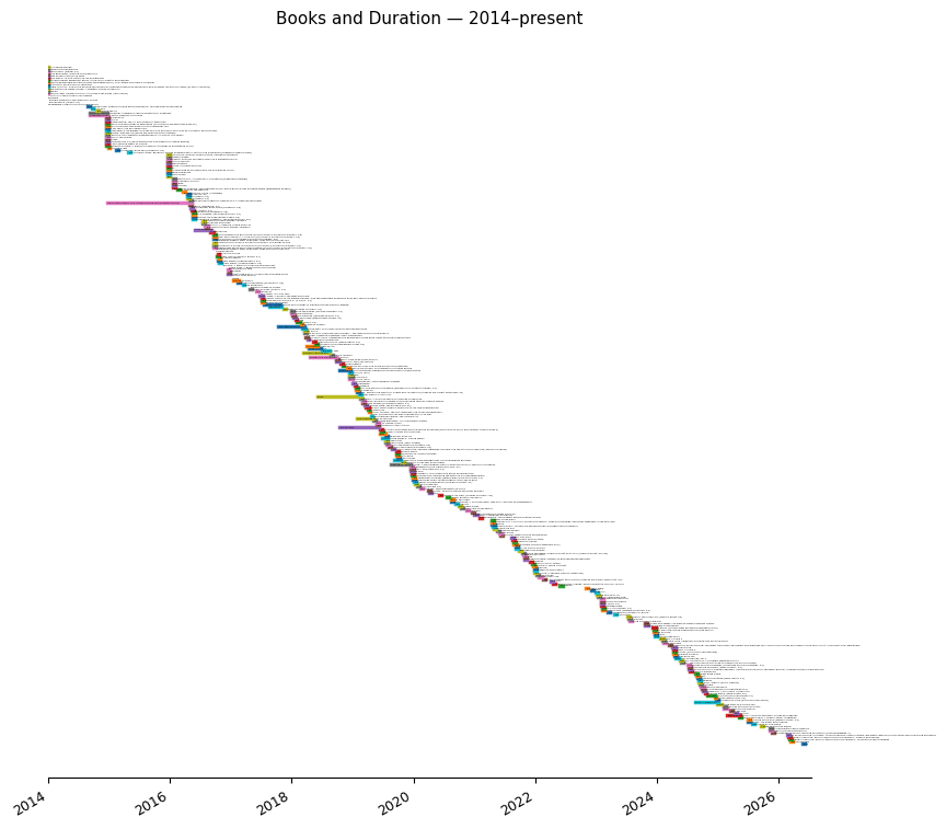
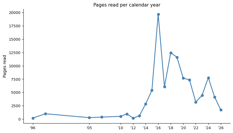
There’s going to be a big stripe this year when I finish Herodotus’s Histories (which I’ve been going at since December), and I’ve been dipping into Letters from America for almost a decade.
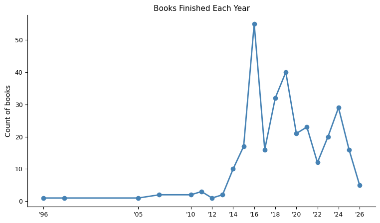
Reading volume has been uneven — there are clearly years where life got in the way, especially the last two.
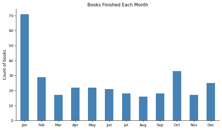
For some reason I don’t really get much reading done in winter, I think it’s because I get cold if I am still for too long.
What I Read

I read more fiction than non-fiction but the gap is smaller than I’d have guessed. The non-fiction skews toward architecture, design, cooking, and economics — genres I work in or cook in. The fiction skews toward speculative: Le Guin, Gibson, Jemisin, Stephenson. Series books are a minority; most of what I pick up is standalone.
I’ve been on Goodreads since 2013 and on ebooks since roughly the same time.
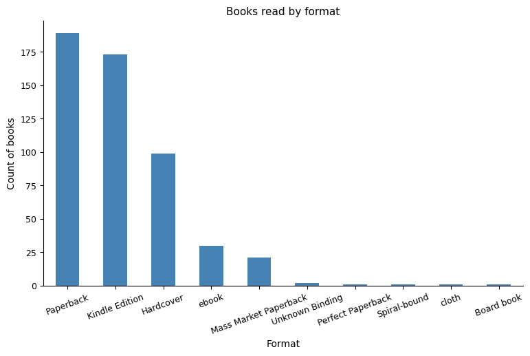
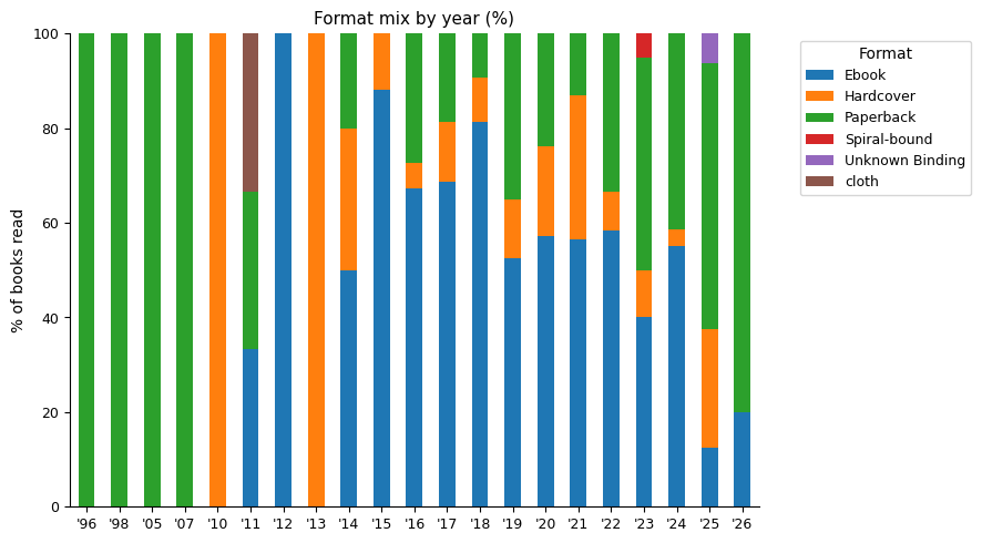
The trend toward ebooks, then the drift back is something I’ve wondered about, it might be because I don’t commute much any more, but I couldn’t tell you. I had an Ondaatje phase in 2023, which was all paperbacks.
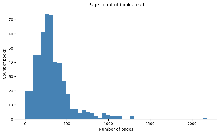
Page count is roughly normally distributed around 300 pages. The long tail to the right is Stephenson, Atwood, and Dostoevsky.
The Books Themselves
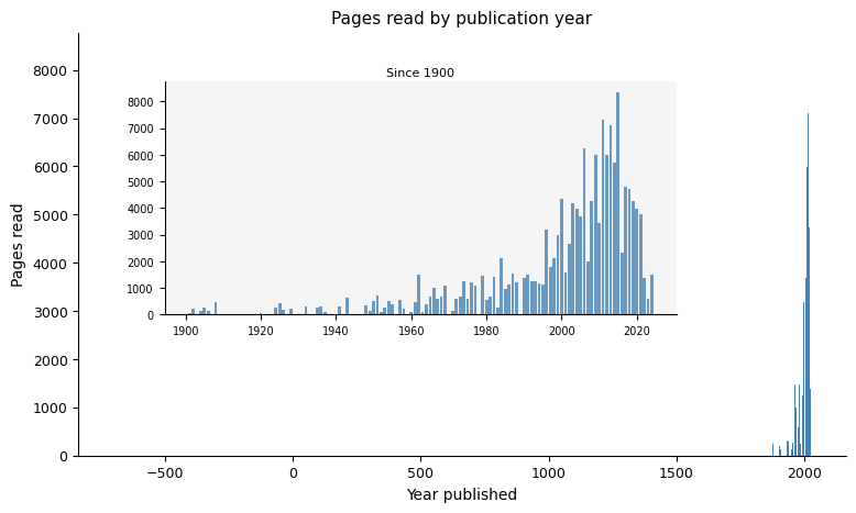
Most of what I read is modern — but there’s a tail going back centuries, with a few outliers at the ancient end (Caesar, Marcus Aurelius, Homer, Frontinus). The inset shows the post-1900 distribution in more detail, where most of my reading is.
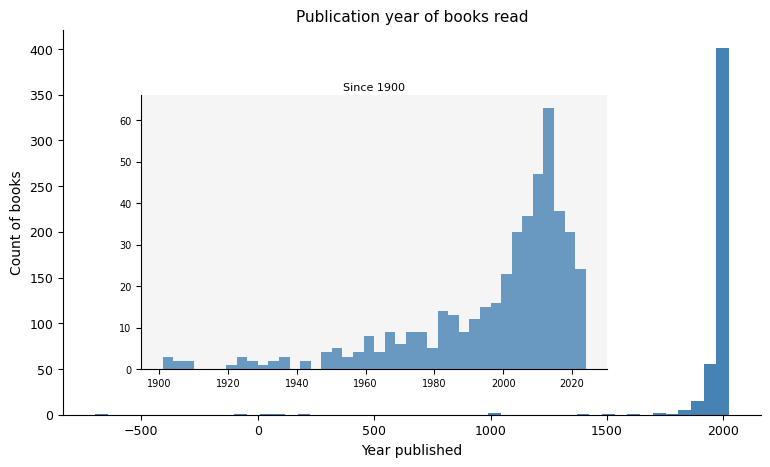
I think I have a policy of not reading new books because if they’re good they’ll still be good in a few years time. Clearly that isn’t the case, and I’m a bit pretentious, as I read loads of new books.
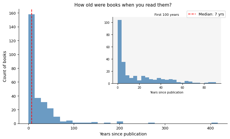
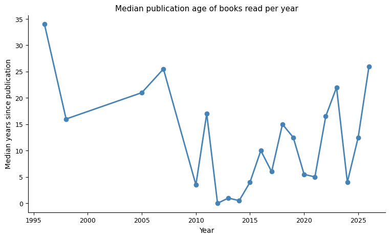
In earlier years I was reading a lot of older material (but I don’t think I can trust the data from before 2010 as I think I just made it up). I’ve been roughly trending older since then.
The ancient books are few but some are long (impressive given how expensive paper was). Neal Stephenson alone accounts for a significant chunk.
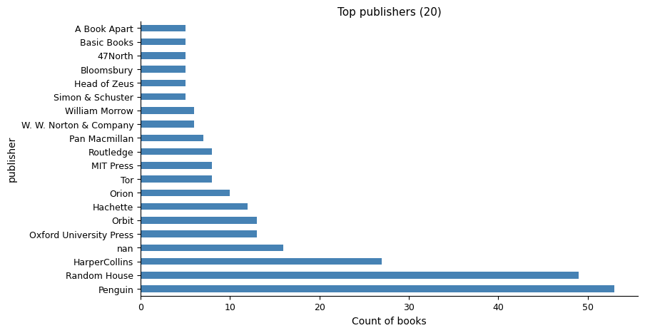
The publishers chart is dominated by Penguin (and its imprints — Vintage, Ace, Cornerstone — merged into one).
How I Felt About It
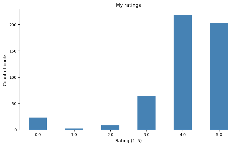
My ratings cluster high — mostly 4s and 5s. If something is looking like it’s going to be a 3 or less I tend to scrap it. I’ll read 3 if it’s for work, but I will complain about it.
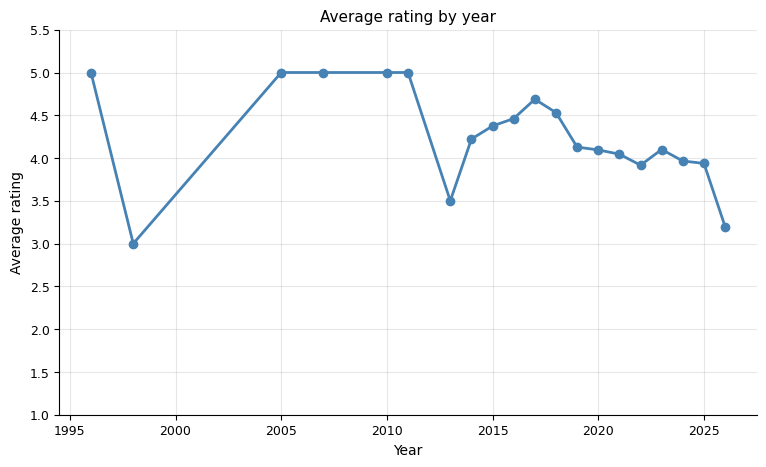
There’s some variation in average rating by year, maybe a downward trend in recent years as I try to use more of the scale. If anything, the years where I read the most broadly also show slightly higher average ratings — which could be selection bias in the other direction.
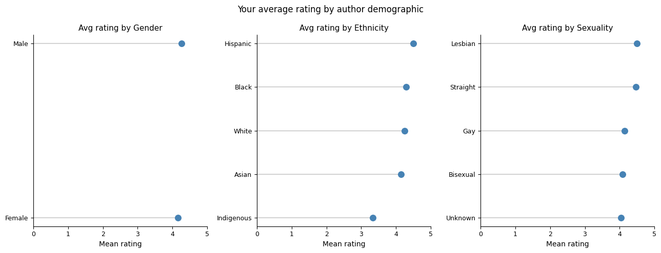
Does the demographic of the author affect how I rate their books? The lollipop chart holds the answer, or fails to. The differences are small enough that I wouldn’t read much into them.
Who Wrote What I Read
The bubble chart gives the clearest view of the gender-by-ethnicity breakdown of the authors I’ve read. The numbers inside each bubble are book counts.
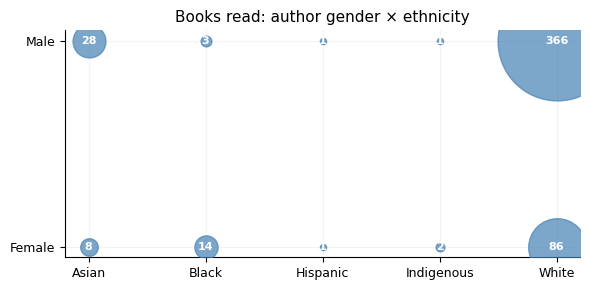
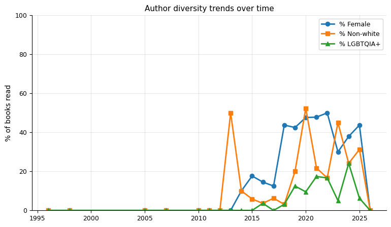
White male authors dominate, which is the structural baseline of English-language publishing — but not a reason to stop there. The diversity trends chart (% of books in a year by female, non-white, and LGBTQIA+ authors) shows how that has shifted over the 12 years.
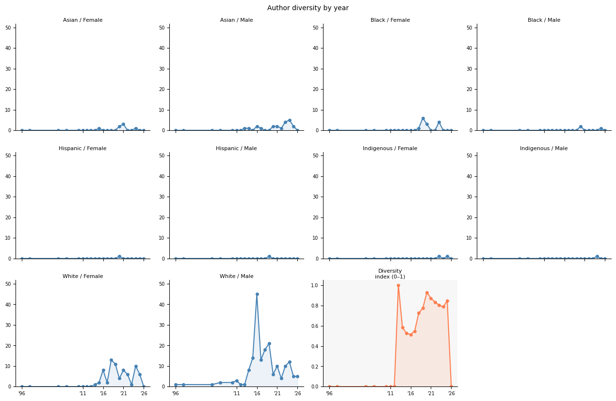
The same data broken into small multiples — one panel per demographic compound, plus a diversity index in the final coral panel. The index is normalised Shannon entropy: 0 means all books that year by one demographic group, 1 means evenly spread across all groups. It at least has the decency to drop in 2016 when I read 50 books by white men.
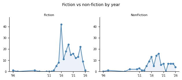
Looking at fiction versus non-fiction split by year:
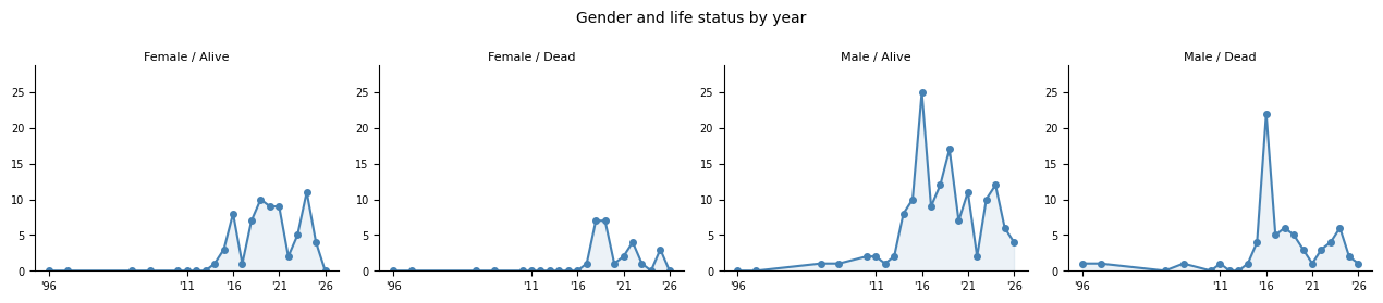
And the gender-by-life-status of authors each year:
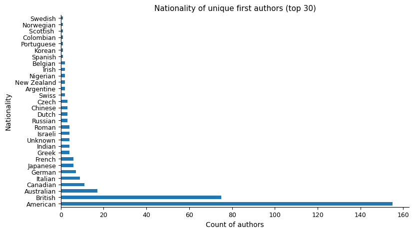
The nationality distribution confirms the Anglosphere dominance of my reading, with Australian authors doing proportionally well for the size of the market.
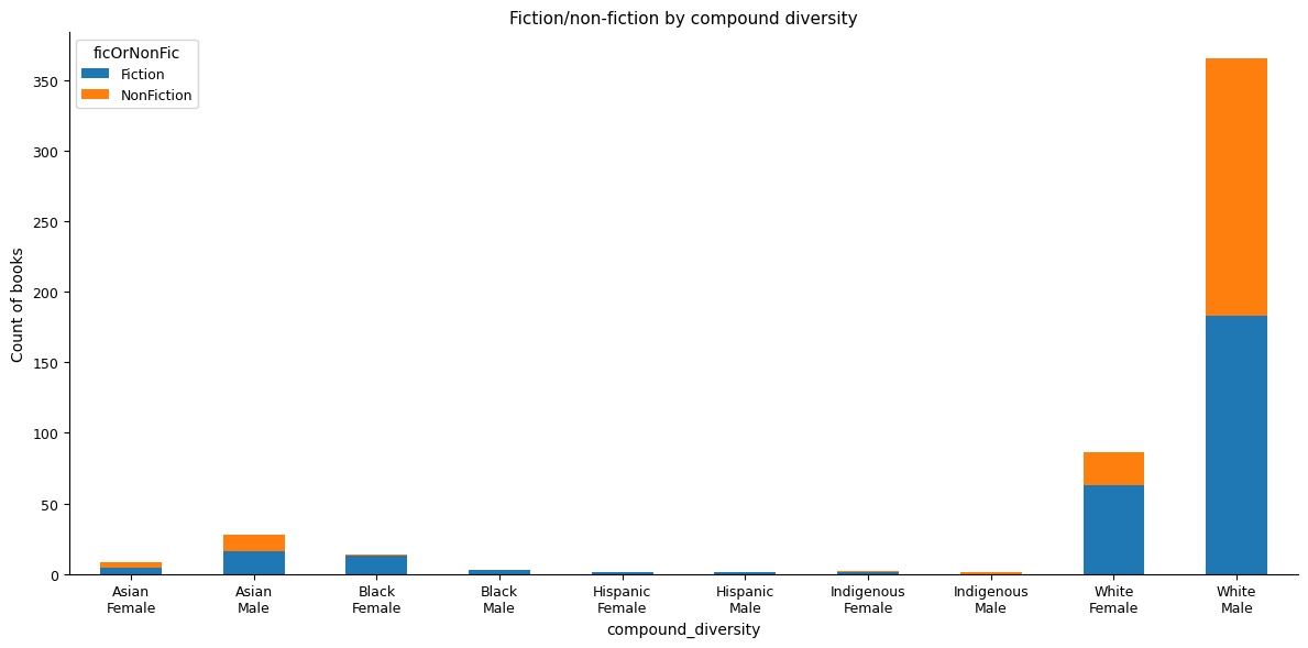
Fiction and non-fiction draw from different demographic pools. The cross-tab between compound diversity and genre shows this clearly — non-fiction leans even more toward white male authors than fiction does.
Depth and Volume
Three books read twice: The English Patient, The Left Hand of Darkness, and The Dispossessed. Everything else, once. (It’s worth pointing out that the graph below is authors whose work I’ve read more than one of, not multiple reads of the same book.)
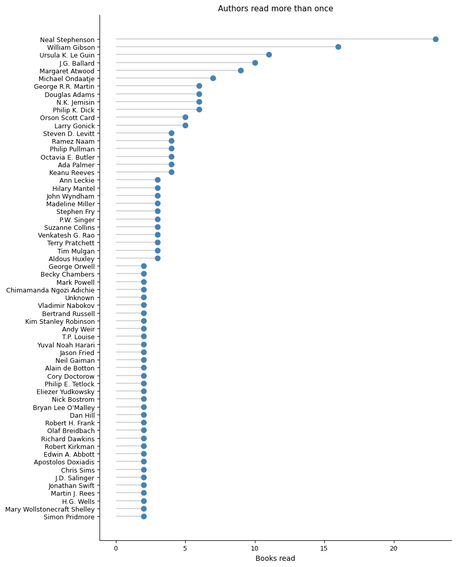
Neal Stephenson at the top by a wide margin — mostly the Baroque Cycle and the Mongoliad series plus a decade of standalone novels. Ursula K. Le Guin second, across the Hainish Cycle and Earthsea. Atwood third (the MaddAddam trilogy). I’m surprised that Game of Thrones isn’t in the list by page number.
Pages per year tracks reading volume differently from book count — a year of long books looks like a high-output year even if the book count is modest.
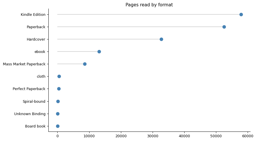
Pages by format: ebooks account for the majority of pages read, but the distribution within format types is uneven. Mass market paperbacks tend to be shorter; hardcovers tend to be the bigger.
What my Kindle highlights say about how I read
Buried in Goodreads’ full data export is a file called grass.json — all the Kindle highlight I’ve synced to my Goodreads profile: the quoted text, any note I attached to it, how far through the book it falls, and which book it’s from. 1,096 highlights across 93 books, 26 of them with an actual note attached rather than just a bare quote.
The obvious stuff first
The books I’ve highlighted hardest are almost all dense non-fiction:
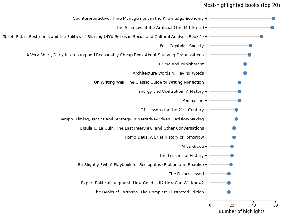
Counterproductive: Time Management in the Knowledge Economy leads with 58 highlights, followed by The Sciences of the Artificial, Toilet: Public Restrooms and the Politics of Sharing, and Post-Capitalist Society. What’s interesting is that I had no memory of reading Counterproductive at all; I wonder if a kindle book is less memorable by title as one just doesn’t see the title and cover very much.
Joined against my book ratings and genre tags:
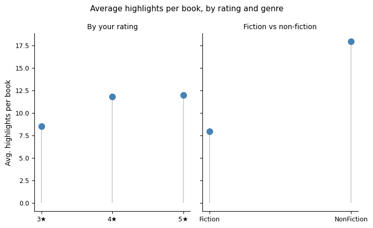
Non-fiction books get 18.0 highlights on average; fiction gets 8.0 — more than double. Rating tells a similar but smaller story: 8.6 highlights/book at 3 stars, rising to 11.8 at 4 stars and 12.0 at 5 stars. Highlighting looks like a decent proxy for how much a book actually landed — though genre turns out to be the bigger driver of the two.
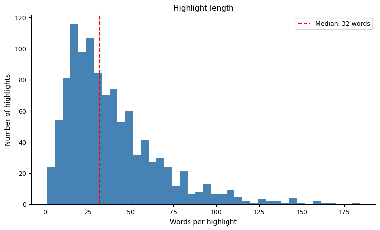
Highlights themselves are short — a median of 32 words, roughly one to two sentences. If I highlighted the first two sentences of the previous paragraph it would be a 36 word highlight.
Do I highlight in bursts, or is it spread evenly through a book?
If you’ve just highlighted something, are you more likely to highlight something else soon after — or is each highlight an independent, one-off decision scattered randomly through the book?
To test it, I took every book with at least 5 highlights, looked at the gap (in % through the book) between each highlight and the next one in the same book, and compared that to a null model: the same number of highlights per book, scattered uniformly at random.
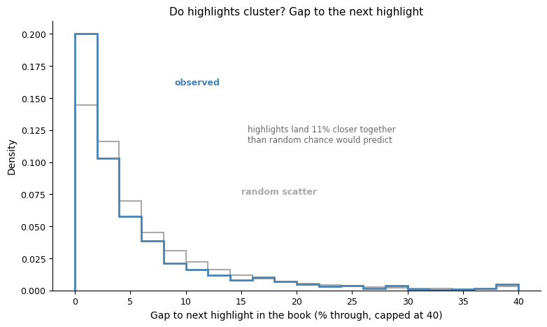
They cluster. The observed gap between consecutive highlights averages 5.07% of a book’s length, versus 5.72% under random scatter — highlights land 11% closer together than chance would predict, and the effect is far too large to be noise. What I can’t tell is if it’s linked to how interesting a specific passage is, or just that I’ve recently used the highlighter, so I’m trigger happy?
Why does the “where in the book” chart have two humps?
Looking at where highlights fall in a book overall (0% = start, 100% = end):
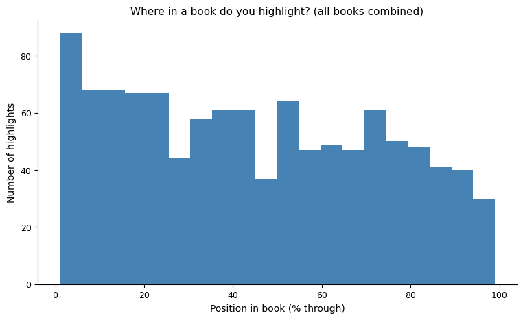
There’s a clear front-loading — the first quarter of a book gets highlighted hardest — but also a second, smaller bump around the 50-75% mark, with a dip in between. Is there something about how nonfiction arguments are structured, or where an author places their best material.
That instinct turned out to be wrong. Breaking the same 9 books out individually tells a different story:
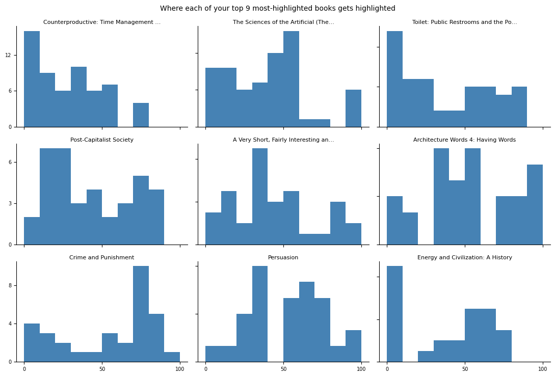
None of them, on their own, has that two-hump shape. Counterproductive is almost entirely front-loaded and essentially dead after 60%. The Sciences of the Artificial is nearly empty for the first 30%, peaks hard at 40-60%, then goes quiet before a small late bump. Crime and Punishment barely gets touched until it spikes around 70-80%. Energy and Civilization is almost all in the first 10%. Each book has its own idiosyncratic peak, in a different place, presumably wherever that particular book’s densest or most quotable material happens to sit.
The aggregate “first and third quartile” shape isn’t a real reading pattern — it’s what you get from summing a handful of heavily-highlighted books with different individual shapes on top of each other. If there’s a genuine general pattern here at all, it’s just the front-loading: highlighting drops off toward the end of a book almost everywhere, probably because early chapters tend to carry more thesis statements, definitions, and framing claims — the stuff that’s easiest to lift out as a standalone quote.